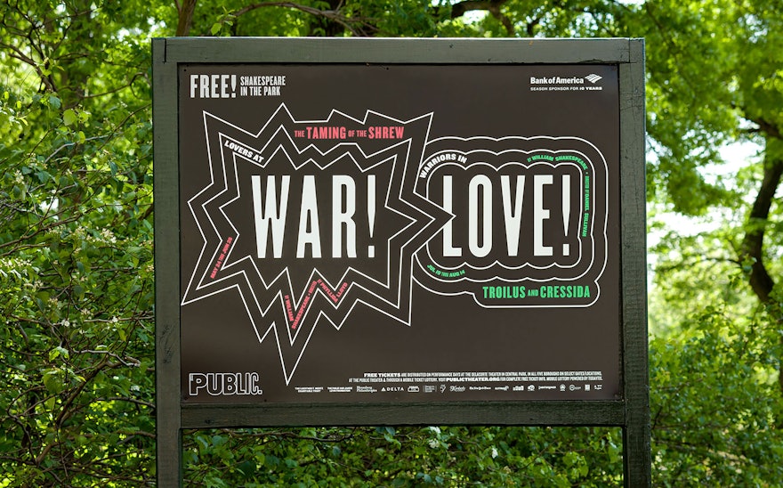
Love and war face off in the 2016 campaign for Shakespeare in the Park, the annual free performances presented by The Public Theater at the Delacorte Theater in Central Park. The program pairs the witty romantic comedy ”The Taming of the Shrew” with “Troilus and Cressida,” the dark historical tragedy set during the Trojan War. This year marks the 400th anniversary of The Bard’s death, and the selected plays encompass the extraordinary range of his work.
Pentagram has been designing the Shakespeare in the Park campaigns since 1994 as part of our ongoing work for the Public. Each year’s season design changes in color and in the use and spirit of Knockout, the font of the iconic Public Theater identity. In the new campaign, created in collaboration with Kirstin Huber, the Public’s art director, the striking typography appears against a black background and is set off with comic-book style outlines. The graphics have been expanded into a complete system of environmental graphics for the Delacorte and swag such as t-shirts and totes.
The Shakespeare in the Park poster campaigns used to exist apart from the fall season campaigns, but over the past several years the graphics for the Public’s most famous program have helped establish the seasonal look for all aspects of the institution. Working with Pentagram, Huber and her in-house team at the Public build on the summer posters to create a full visual personality for the theater in graphics that appear on posters, the season brochure, print advertisements, the redesigned website, and banners for the façade of the Public, as well as promotional materials for Joe’s Pub.

