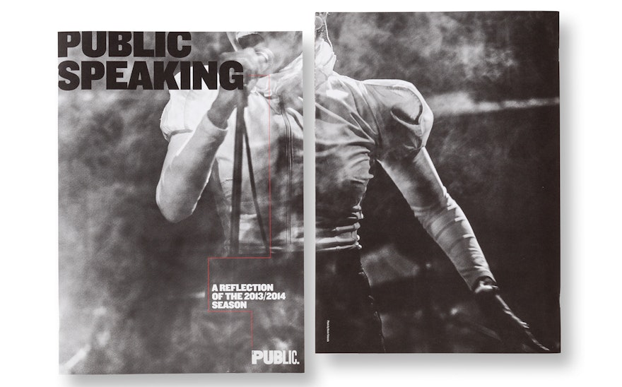
In the two decades that Pentagram has worked with The Public Theater, there's one thing we've never designed for the institution: an annual report. To celebrate an important season that saw an increase in membership and donors, and as well as the development of several landmark productions, The Public has issued Public Speaking, a review of its activities during 2013-2014. Drawing on our iconic identity for The Public, Pentagram has designed a lively and engaging publication that helps the institution strengthen its relationship with its community and audiences.
The Public regularly keeps it members and donors up to date with bulletins, but wanted to do something special to commemorate 2013-2014. The season included remarkable productions like the musical adaptation of Alison Bechdel's Fun Home; David Byrne and Fatboy Slim's disco-operetta Here Lies Love; and the play The Library, directed by Steven Soderbergh and written by Scott Z. Burns. The period also marked the tenth anniversary of the Under the Radar Festival and the 15th anniversary of Joe's Pub, as well as the completion of the Public's extensive lobby and façade revitalization (with award-winning environmental graphics), and the launch of a dynamic new website.
Designed in an oversized format like a souvenir theater program, Public Speaking presents an entertaining overview of The Public during a time of great creative success. Interesting and unusual facts and figures about the reach of the theater and its programs are highlighted throughout the publication: For instance, an astounding 76,409 audience members attended shows at the Public during the season, coming from nearly every state in the US and over 65 different countries. Twenty-five percent of the attendees at Shakespeare in the Park were first timers, and 20 percent have been five or more times.
The report also features interviews and statements from directors and curators of various series and initiatives; stories shared by patrons about waiting in the line for free tickets to Shakespeare in the Park; and a list of honors and awards received by the featured productions. For one spread, the designers created a timeline illustrating the network of collaborations behind the season's plays and musicals. Typography is set in the Public's signature font, Knockout, and striking performance photography is offset by a black, white and red color palette that echoes our first campaign for The Public, 20 years ago.

