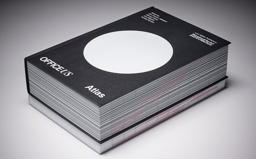
OfficeUS, the U.S. Pavilion at the 2014 Venice Architecture Biennale, was conceived as a working architecture office that explored the ways in which U.S. architectural practice has influenced the discipline around the world over the past 100 years. Pentagram has designed OfficeUS Atlas, a new book that compiles and interprets the research assembled in the exhibition’s OfficeUS Repository, an archive of nearly 1,000 projects produced by U.S. offices abroad between 1914-2014. The publication is the second in the four-volume OfficeUS book series, following OfficeUS Agenda, also designed by Pentagram.
A massive, 1,232-page compendium, Atlas is structured around a highly organized mix of firm profiles, project data, press records, and infographics that detail the transformations of the U.S. architectural office and its international impact over the past century. The book design builds on the graphic identity Pentagram developed for the OfficeUS installation, which utilized a visual language built out of the efficiencies of office culture.
OfficeUS Atlas is published in partnership by Lars Müller Publishers and Storefront for Art and Architecture, the lead organizer of OfficeUS. The designers worked closely with the Atlas editors, Eva Franch i Gilabert, Michael Kubo, Ana Miljački and Ashley Schafer, to develop the format of the book. At the U.S. Pavilion, the Repository was presented as a system of 1,000 binders that lined the walls of the installation. Rather than preserve this material as a unchanging collection of data, the editors wanted Atlas to bring it to life and expand on the goals of the exhibition—to present an untold history that would provide seeds for future research, and provoke further discussion and debate.
In highlighting some of the major historical narratives threaded through the century, Atlas uses the timeline of offices and projects established by the exhibition as its backbone. Given the sheer size of the archive, the editors and designers first considered arranging the book like an encyclopedia—with one page per project—or as a simple chronology. Instead, to bring out the themes, Atlas collects the exhibition research in the form of a reader, sequenced across 21 chapters that cover topics like “Crude Ideals: Architecture and Oil in the Gulf States,” about the growth of U.S. architecture in the Middle East, and “Intercontinental Comfort: Little America Abroad,” about the hotel building boom.
The finished Atlas features a timeline of 675 projects abroad by 169 US offices, illustrated by over 1,200 photographs and architectural drawings. The book presents only a small selection of the immense press archive that was compiled for the exhibition. In addition to showing the progression of architecture and architectural offices, it also documents the evolution of architecture journals, magazines and other publications over the past century, showing trends in editorial design.
With so much information to be included, the designers had to develop a rigorous system to organize the material. Chapters are introduced with a brief essay, then followed by infographics that explore the subject. Black pages are used to display themes and source pages, with scanned articles placed on a black background. White pages are used for office profiles and project data. A timeline on the edge of each page, carried over from the design of Agenda, helps orient the reader within the 100 years the book spans. Firm timelines appear on the left, and theme timelines are on the right. (The book opens with a guide to “How Atlas Works.”)
Atlas was originally planned to be a paperback like Agenda, but once the book grew to 1,232 pages, it became clear it would be better bound as a hardcover book. Each cover of the OfficeUS series graphically represents its subject in a simple arrangement of dots. The cover of Atlas features a single circle, representing the globe or the sum total of the Repository. (The cover of Agenda featured a grid of 168 dots, correlating to the timespan of the five-month Biennale.) Atlas is set almost entirely in Arial and Times New Roman, selected by the designers for the OfficeUSgraphics because the ubiquitous, workaday fonts complement the context of a working office, as well as the overarching “Fundamentals” theme of the Biennale. A black-and-white color palette also fits in with the elemental look.

