As YouTube has matured into a source of original programming with audiences to rival those of any television network, its homegrown channels and series are finding themselves in the enviable position of needing many of the elements of more traditional broadcasting, including branding.
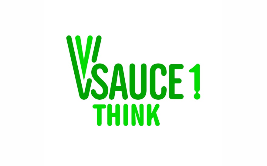
Pentagram has collaborated with YouTube to develop a new brand identity for Vsauce, the group of wildly popular educational channels that feature videos on science, technology, gaming, and more. Establishing a cohesive look for the Vsauce platform, the identity plays off the unusual name and playful point of view with “fluid” typography and fresh, contemporary graphics.
One of YouTube’s fastest-growing channels, Vsauce averages over 20 million viewers a month and has over 8 million dedicated subscribers. It was launched in 2010 by the Internet personality Michael Stevens, who helps make science viral in "edutaining" videos that ask semi-absurd questions like “Is anything real?,” “How much does the Internet weigh?,” and the channel's most popular video, with over 15 million views, "What if EVERYONE jumped at once?" (Designers may know Stevens from his humorous "Defense of Comic Sans.")
With the channel’s rapid growth, the team at Vsauce never really had an opportunity to think about identity and how it could help build longevity for their brand. They enlisted Pentagram to develop a disciplined, comprehensive system that would preserve the unpredictable spirit of the platform while helping to make it accessible to a wider audience. Along with the original Vsauce, or Vsauce1, the system integrates the additional channels launched in 2012: Vsauce2, hosted by Kevin Lieber; Vsauce3, hosted by Jake Roper; and WeSauce, which celebrates the creativity of the Vsauce community.
Each of these channels focuses on a different subject, and an important part of the project was finding a way to distinguish them as individual entities. Expanding on the existing nomenclature, the designers added a single-word tagline to each channel name that hints at the specific content: “Think,” for Vsauce1, which focuses on a mix of scientific and philosophical questions about the universe; “Find,” for Vsauce2, which features knowledge and technology; and “Play,” for Vsauce3, dedicated to fictional worlds and video games in particular. The channels are also represented by different colors: green for Vsauce1, blue for Vsauce2, purple for Vsauce3, and red for WeSauce.
The typography of the identity riffs on the Vsauce name with rounded letterforms that suggest liquid or sauce. (The one-of-a-kind name was originally generated using fakenamegenerator.com.) The wordmarks appear in a customized Alternate Gothic No. 2, and feature an enhanced letter “V” or “W” that can also function as a monogram. A round drop is added to the number of each channel, enhancing the idea of fluid. The identity’s primary typeface is Din Next Rounded. The type is a logical update of the previous logo, which was set in Alsina.
The liquid quality of the typography extends to colorful banners that landmark each Vsauce channel page. The designs feature graphic patterns that echo the forms of the logo and include "windows" for dropping in images that highlight specific videos or the subject at hand. The drops of the logo can also be used to build patterns for posters and other promotional materials. For an added bit of fun, the team also created graphic avatars of the Vsauce hosts, the “faces” of the channels. The illustrated hosts wear the colors of their respective channels, and appear in the branding on their channel pages.
Looking forward, the identity lays the foundation for future endeavors as Vsauce continues to grow. "Vsauce has evolved into an incredibly clean, strong and vibrant brand. Not only can our new logo effortlessly work across different media, but it's memorable," says the team at Vsauce. "Overall, it's simple, but powerful, and that's why we love it."

