
The brand identity emphasizes Vroom’s convenience, accessibility and ease of use.
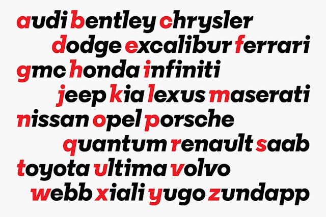
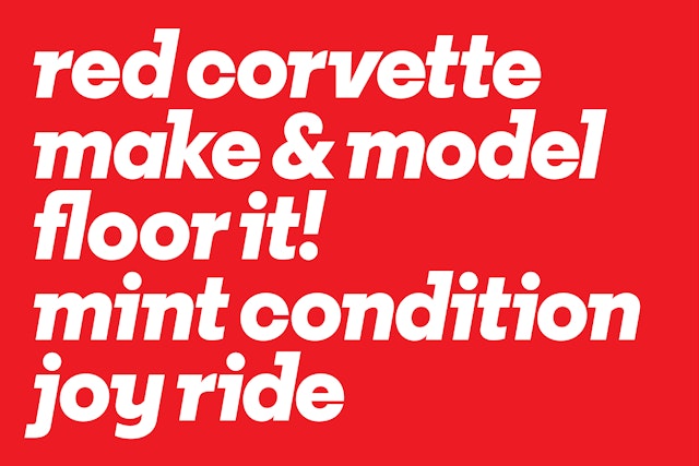
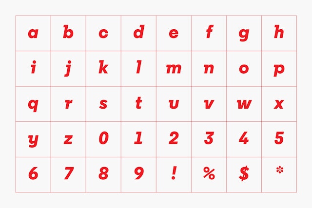
The identity is built around a custom typeface, Vroom Sans, with italicized letterforms that evoke a feeling of forward motion.

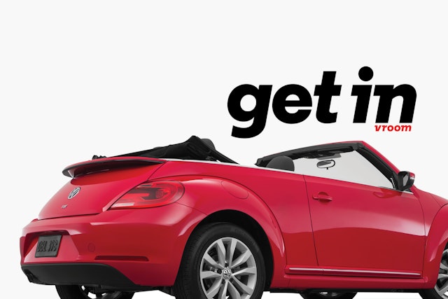
Advertising makes the cars the stars in crisp, clean treatments that play with type and image.


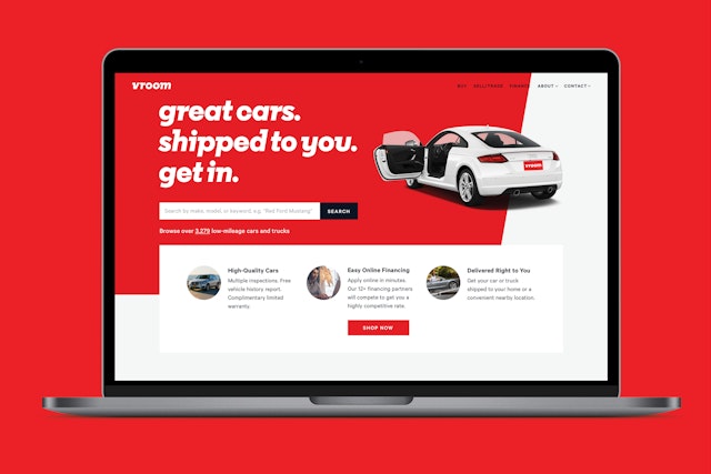


Buying a used car used to require haggling with a high-pressure salesperson to get a better deal and hoping that the auto actually lived up to the hype. Vroom is an online direct retailer working to change all that and make the process of buying and selling high-quality used cars as fast, easy and trustworthy as possible. Customers can filter searches by body type, year, price, mileage and make, and get the car delivered free, right to their door. Every auto in inventory is certified, and the low price you see is the price you get. (One of Vroom’s taglines is “Thousands of cars. Not a salesman in sight.”)
Pentagram has worked with Vroom to develop a new brand identity that emphasizes the platform’s convenience, accessibility and ease of use. With a name as good as “Vroom,” the designers didn’t need to do much. Rather than create something visually clever and car-related––like make wheels out of the O’s––they decided to let the word do the work. The identity is built around a custom typeface, Vroom Sans, with italicized letterforms that evoke a feeling of forward motion and driving a car. The typeface is based on the geometric Regular Extrabold Italic, designed by A2-TYPE and specially customized by A2 for Vroom with trailing slab serifs like racing fins and descenders with swooping curves. The logo reinforces the ideas of speed and freedom, key to Vroom’s appeal.
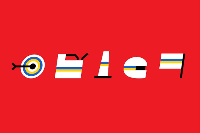
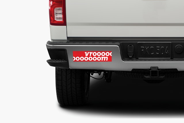
The wordmark is accompanied by a simple monogram with Vroom’s lowercase “v” in a circle. The slant of the logotype carries through to other elements in the visual language, including a series of custom icons inspired by dashboard symbols and a diagonal background line that echoes the angle of the typeface (at 10 degrees). The branding utilizes a bright, sporty red that captures the energy of the name and sets Vroom apart from the blue typically used by tech companies. An extended palette of primary colors borrows from speedway racing flags.
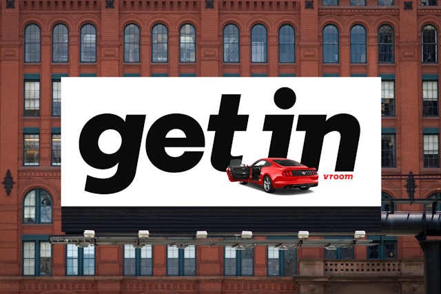
The Pentagram team worked with Anomaly, Vroom’s agency of record, to develop the look and feel of advertising. The cars are the stars in crisp, clean treatments that make the automobiles the focus, sharply silhouetted on white, a riff on the minimalism of classic Volkswagen ads. The design plays with the scale of images and typography to express Vroom’s dynamic point of view. The branding launched with a TV spot directed by the comedy duo Tim and Eric.
