Currently ranked #14 on the Fortune 500 list, Verizon is one of the largest communication technology companies in the world and the largest wireless provider in the United States. The company was born in 2000, the result of a merger between Bell Atlantic and GTE. The new company adopted as its name a portmanteau of veritas and horizon, and a logo that today appears everywhere from big rig trucks to handheld devices.
The complexity of the original Verizon logo — it incorporates a modified italic typeface, two colors, a stylized letter “z,” a v-shaped form that sometimes appears above the name and sometimes next to it, and gradations in multiple locations — has made it difficult to reliably reproduce in different media. This inconsistency has only increased over time.
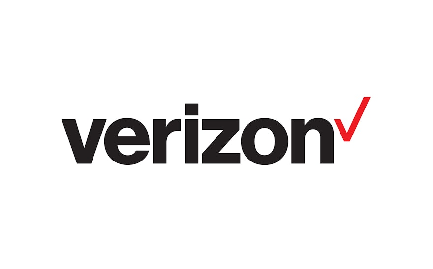
More importantly, over the last fifteen years the way we communicate has changed dramatically, and so has Verizon. The company introduced a dramatically simplified new logo designed by Pentagram that reflects those changes, and positions the company for the future.
The new logo retains the essence of the original logo’s DNA and realigns the mark with Verizon’s core values: simplicity, reliability, and dedication to its customers. The customized letterforms have been eliminated in favor of a straightforward treatment of the company name in Neue Haas Grotesk, fine tuned by Christian Schwartz of Commercial Type. The color red — long a salient feature of Verizon’s identity — serves as an accent, in a brighter, cleaner hue. Finally, the “v” symbol is now a checkmark, the universally understood symbol for getting things done. Placed at the end of the wordmark, the checkmark serves as a sign-off and endorsement to the Verizon name.

