Verizon is one of the largest communication technology companies in the world. Headquartered in New York, it offers voice, data and video services and solutions on its award-winning networks and platforms, delivering on customers’ demand for mobility, reliable network connectivity, security and control.
Pentagram developed the visual identity for Verizon in 2016 and since then has an ongoing relationship developing the brand across packaging, product, digital and retail.
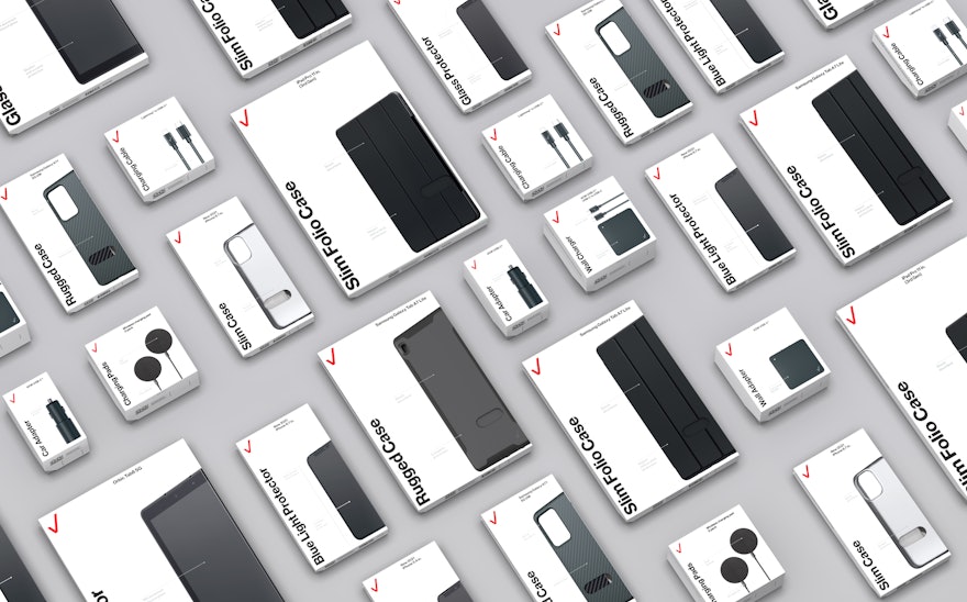
In 2021 Verizon launched a new range of own-brand mobile phone accessories which can be purchased online or in Verizon stores. The products feature upgraded materials with improved sustainability and the range includes phone cases, chargers, wireless chargers, cables, car adapters and screen protectors. Pentagram developed the packaging for the new range, responding to a brief which was to improve the packaging structures to provide better product protection as well as to develop an enhanced unboxing experience for customers. The new packaging also needed to demonstrate sustainability and accessibility improvements.
Improving the packaging structure and unboxing experience whilst reducing environmental impact is challenging, so the design team worked with Giraffe Innovation to establish the carbon footprint of each component of each existing package, covering materials, design, manufacture and shipping. This analysis highlighted the opportunity to make carbon footprint savings if the package sizes were reduced significantly and all plastic components were removed.
As part of the size reduction exercise, fold-up cardboard hangers were created to allow the package to be shipped in the smallest form possible with the hanger being flipped up for use in retail environments if needed. To maintain structural integrity at the smaller size, an inner product tray was added which also creates a product-as-hero unboxing experience. All the cardboard elements are made from certified responsibly sourced 100% post-consumer waste recycled material
By adding a tear-strip opening to each package, plastic tamper seals could be completely removed. The tear strip area is highlighted with a V cut-out based on the geometry of the Verizon checkmark, improving identification and accessibility. The design team were able to entirely remove plastic from the packaging, using physical cut-outs for viewing products rather than plastic windows and replacing all plastic product wrappings with paper. The packaging carries Verizon’s 100% Ready to Recycle messaging.
A fresh graphic approach was taken with large vertical text for product names allowing easy visual identification in busy retail environments. Product features are called out in silver ink and informative photography is used so there is no need for customers to open boxes in the retail environment. The packages are printed with vegetable/soy-based inks.
Analysis of the final designs by Giraffe Innovation showed that the new packaging achieved a 22% reduction in CO2e compared to previous packaging. This was achieved through smaller sizes, use of more post-consumer waste material and the complete removal of plastic.

