The system is flexible, easy to update and allows the museum’s name to remain at the center of the identity while calling out the secondary information in orange.

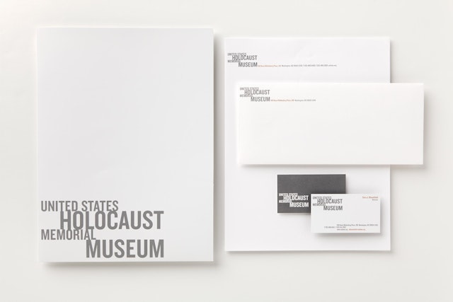
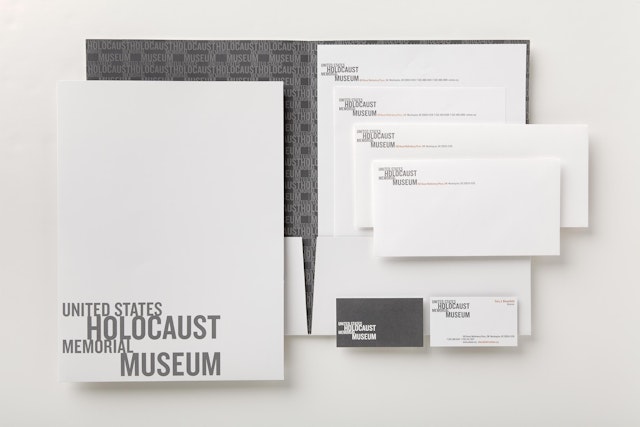
The United States Holocaust Memorial Museum is America’s national institution for the documentation, study and interpretation of Holocaust history. It is also the world’s foremost authority on genocide and is actively engaged in the prevention of genocide around the world. Pentagram has developed a new identity and institutional communications system for this highly regarded museum that reflects the power and dignity of its mission. The identity relies only on words, while being versatile enough to speak to the museum’s varied audiences: survivors, descendants of survivors, world governments, scholars and visitors.
Chartered by an Act of Congress, the museum, located adjacent to the National Mall in Washington, DC, is charged by the American government with educating the public about the Holocaust, preserving the memory of those whose suffered from its effects and enhancing the country’s moral discourse in relation to past, present and future acts of genocide. In this capacity, the museum has numerous education and research initiatives that extend far beyond its walls, including public programs, the distribution of educational materials and teacher resources and providing a strong web presence in over twenty languages. In one of many forward-thinking technology-based programs, the museum has partnered with Google Earth to create the World Is Witness "geoblog," which documents and maps crimes against humanity worldwide.
Many Holocaust organizations represent themselves with illustrative symbols like flames, hands and other cloying icons, often conveyed in a primitive manner (and many reminiscent of the drawings of Ben Shahn or Saul Bass’ Exodus logo) with the idea that the icon’s literalness creates an emotional connection, but this approach can be limited in its reach and may ultimately diminish the seriousness of the organization's mission. The United States Holocaust Memorial Museum, with its international initiatives and broad constituency, required a logo capable of representing all of the museum’s facets. The previous Holocaust Museum logo relied on an icon of museum’s powerful building designed by architect James Ingo Freed, but now, 15 years after the museum opened, its mission and purpose is much broader than its famous building. Without the use of symbols or graphic metaphors, the new identity is memorable and recognizable, while possessing emotion and gravitas.
The identity forms the backbone of our work for the museum, and its elements are carried across the whole of the communications system. The United States Memorial Holocaust Museum is a long name, and the logo has been designed to make it appear shorter by emphasizing the words “Holocaust” and “Museum.” The different sized typography coupled with the staggered positioning gives the logo the appearance of motion, symbolizing the present moving on from the past while it maintains a deeply rooted connection.
The identity is composed of two typefaces, one bold—Knockout designed by Hoefler & Frere-Jones—and the other classical, Merlo from Feliciano Type Foundry. The main color palette is black and white, signifying the institution’s continual goal to discover and promote the truth. Sometimes gray is used to create distance and dignity, while orange rust is used sparingly as an accent color to differentiate information. The liberal use of white space is also an integral part of the identity, conveying elegance, dignity, gravitas and eloquence.
A lockup system has also been created for when certain campaigns, events or museum initiatives need individual logos. The system is flexible, easy to update and allows the museum’s name to remain at the center of the identity while calling out the secondary information in orange.
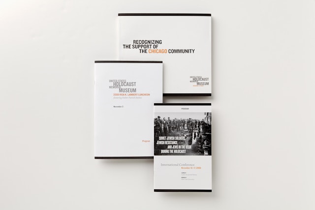
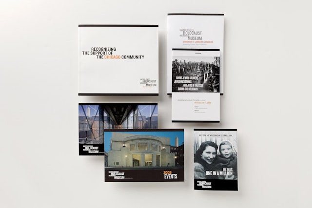
The educational brochures the museum produces as part of its ongoing mission to end genocide, as well as those for annual giving campaigns and membership drives, utilize the same design elements we established for the identity. To reinforce the museum’s mission to use the Holocaust as a lens to examine current international affairs and prevent genocide, the designs are particularly engaging. The black bars and bands used within the identity system create a powerful journalistic feel, as do the photography choices that are powerful, clear and sometimes unflinching, but never cloying. As photographs are seen as evidence, they are never obscured or weakened with ornamentation; instead they are used in a clear, large-scale manner. Printed materials feel similar to a well-designed magazine on world affairs, like Time.
The museum's donor societies include the Wings of Memory Society, the Legacy of Light Society and the Founders Society, each keeping with the established pattern of being represented by name only, without a distinguishing mark. The societies are differentiated from each other through color (gold, blue and purple) with the word society remaining gray as a unifying element.
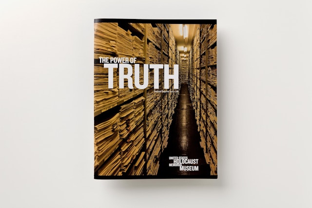
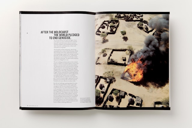
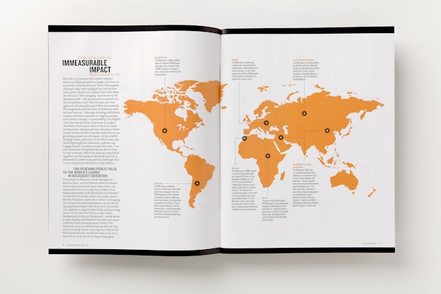
Pentagram also designed the museum’s annual report in collaboration with the museum’s in-house design team lead by Director of Publishing Lea Caruso. The cover utilizes a bold photograph that draws the reader inside, while it alludes to the vast amount of Holocaust-related research and documentation that been done and the tremendous amount of information that is still unknown. The headline plays off the staggered typography of the identity, while the different sized letterforms emphasize the word truth, a word that is central to the museum’s mission. Inside, black and white are the dominant colors, creating an alternating feeling of hope and accomplishment intermingled with distress at the current crises in Darfur, Rwanda and the Democratic Republic of the Congo. Also carried over from the identity, the accent color orange is utilized throughout the report to create hierarchies of information as well as providing a unifying thread.
Office
- New York
