TradingView is a hugely successful social network of 30 million traders and investors who use charts and analysis tools to spot opportunities to profit from global markets. As well as placing trades directly on its charts, TradingView’s 30 million monthly online users rely on it to follow their favourite assets, discover new trading ideas, spot trends and connect with other traders.
Pentagram was approached by TradingView to create a new brand identity that distinguished it from its competitors and was relevant to how the business operates today. TradingView’s Chief Marketing Officer James Maddison explains: “Our old logo was based on a cloud, to symbolise ‘the cloud’, and a line chart to symbolise our charting product. The problem was, cloud computing is now ubiquitous, and there are lots of logos using this language and—a decade on—charts only represented part of our total product offering.”
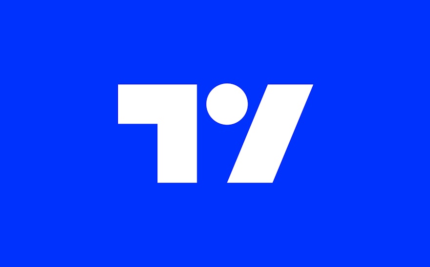
Referencing the idea that knowledge is power, the team at Pentagram devised a new tagline for TradingView—‘Look First / Then Leap’—this epitomises their users’ keen entrepreneurial spirit and expresses the vision ‘always an informed decision’. The TradingView logo is at the centre of the new brand identity and features abstract shapes based on the letters’ T’ and ‘V ‘. Sleek and modern, the symbol is formed of three shapes: the right angle representative of a frame or focus around a viewpoint, a dot which represents an eye (linking back to ‘Look First') and a forward slash which is representative of the ‘Leap' or decisive moment.
The primary colour palette consists of black and white. The secondary colour palette features two complementary shades of blue and a more colourful tertiary palette with turquoise, orange, and purple. These are used to illustrate the trading chart, which is a key part of TradingView’s offer, and the team worked hard to find colours that would work when the chart is viewed in both the light and dark themes.
Dynamic photography is used throughout the brand identity. Featuring people embracing highly skilled and adrenaline-heavy sports such as diving, snowboarding and rock climbing, it too echoes the idea of educated risk-taking championed in TradingView’s tagline.
A dynamic angle has been taken from the TradingView monogram, creating a strong visual ‘edge’ to the graphic system that acts as an intersection between photography and typography and reflects the core idea ‘Look First / Then Leap’.
The team also created icons that are employed to flag features such as upgrades, open-source, and indicate when more extended time periods are involved.
The identity features Euclid Circular B as a headline font. Based on elementary geometric shapes and constructed of monolinear lines; this is combined with Vincent Connare’s Trebuchet for body copy. With a truly global platform and numerous different devices used for access, it was necessary to use fonts that would support the twenty different languages used. For clarity, monospaced numbers were used throughout.
The final implementation, including the creation of the launch video with Alex Honnold, was carried out by TradingView's inhouse design team. James Maddison adds: “The Pentagram team started at the very foundations and worked with us to understand all the different nuances of our brand vision, mission and ambitions, as we saw them. They then translated these multifaceted concepts into a new logo, colour scheme and slogan which perfectly encapsulated the essence of the brave new brand we wanted to build.”

