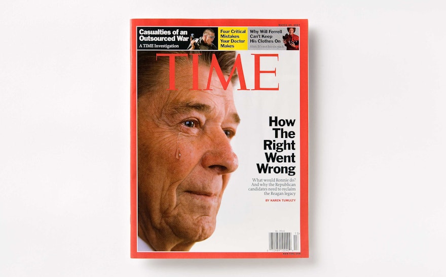
In 2007, TIME launched the first issue of a major redesign developed by Pentagram with TIME managing editor Richard Stengel and art director Arthur Hochstein. As Stengel says in the editor’s letter in the new issue, “This issue of TIME marks a new beginning. The magazine has a new look and structure. Every issue of TIME tells a larger story about the world we live in, and we wanted to create a design that would best present that story.”
The magazine has been organized into four clearly defined sections—Briefing, The Well, Life and Arts—to help readers navigate the content and provide the magazine with a stronger structure. The sections are sign-posted through the use of bold headlines. The front of book section, formerly called Notebook, has been renamed the more active title “Briefing,” and is designed to contain an easily ascertained roundup of the previous week’s events, short news items and the popular Milestones and Verbatim sections.
Briefing is followed by Commentary pages, where the magazine’s columnists, who include Joe Klein, Walter Isaacson and William Kristol, have been emphasized. The Well features both long and short articles, including the cover story. In the Life section writers have been given more prominence, with small silhouetted portraits that appear at the top of the pages. Finally, the Arts section reviews and reports on culture, books, movies and music in a clean and updated manner.
Web touts have been embedded throughout the magazine that indicate related content at TIME.com. The contents page has been re-imagined on a horizontal axis, like a timeline. The size of the cover logo has been reduced, a decision that allows for secondary cover lines and images to be run in a row of boxes above the logo.

