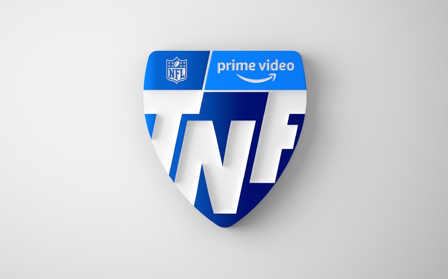
Prime Video will become the exclusive home for Thursday Night Football this fall in the first year of a historic 11-year agreement with the NFL. Pentagram has created a new brand identity framework for TNF that captures the excitement of the primetime games and puts fans at the center of the experience. The logo launched with a TNF brand spot during Super Bowl LVI between the Los Angeles Rams and Cincinnati Bengals.
Pentagram partners Emily Oberman, Eddie Opara and their teams collaborated closely on the identity with leadership at Amazon Prime Video, including Marc Patrick, Global Head of Marketing; Evan Brady, Head of Marketing; and Jonathan Munz, Campaign Manager, Sports. With this new partnership, Prime Video will become the first streaming service to air a season-long exclusive national broadcast package from the NFL. Amazon wanted to rebrand TNF in a way that built Prime into the look and feel of the brand, while still staying true to the graphic personality of the NFL.
The brand strategy developed by Pentagram is rooted in the incredible energy and athleticism of football—its sense of movement, drive and speed; and the spirit of passion, connection and enthusiasm fans have for the game. The logo combines Prime and TNF in a shield that merges the tip of the arrow in the Amazon smile and the pointed shape of a football. The streamlined shield evolves the previous TNF logo and nods to the iconic NFL shield itself.
Football is all about driving plays forward, and motion is key to the brand, bringing it to life in dynamic expressions. Alternate versions of the logo scramble the “TNF” letterforms like players interlocking in explosive moments on the field. The custom type (designed with Displaay Type Foundry) is an italic that pushes ahead in tight formations. The brand color is Prime blue, in shades that include a gradient that transitions from day to night blue.
Graphic patterns of line and type give depth and dimension to the identity, inspired by team formations, game plays, and the roar of the fans. The distinctive shield shape radiates in patterns of lines that rotate like the spiraling spin of a football throw, or push forward with the illusion of dimensional perspective.
The flexible identity will continue to rollout across broadcast graphics, promotional campaigns and other brand expressions throughout production next season. The framework is adaptive and can be updated in fresh and surprising ways, such as incorporating images of players, teams and games, or textures like the skin of a football or the green of the field.

