Each week "This American Life" presents funny, thought-provoking and relatable first-person narratives on the American experience read by the authors themselves. Hosted by Ira Glass, the show’s creator and producer, “TAL” is syndicated by Public Radio International on over 500 public radio stations across the country and has an audience of 1.8 million listeners. The show has introduced the distinctive voices (literally) of writers like Sarah Vowell, David Sedaris and David Rakoff, and has expanded into live tours, books, television and films, like Mike Birbiglia’s current "Sleepwalk with Me."
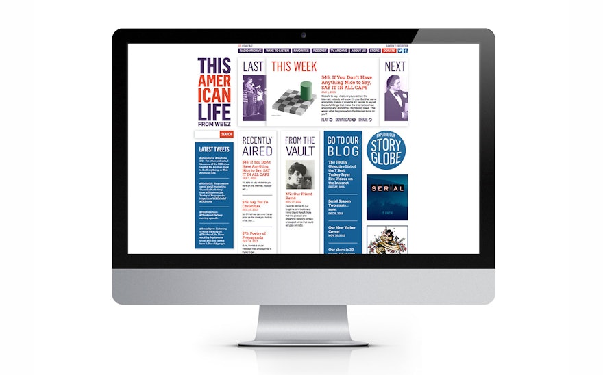
“This American Life” is also the most popular podcast in the nation, and the show’s website is an important part of its reach. Pentagram has updated the TAL website with an accessible, playful design that matches the show’s smart, friendly sensibility. The refresh improves navigation, adds new ways to search the show’s archive, and makes the site more dimensional with added use of color. The update builds on the TAL identity and previous version of the site. The designers worked closely with Ira Glass and TAL director of operations Seth Lind on the project, which includes a new user interface created by Liz Danzico.
The redesign organizes the site’s content so listeners can more easily find current and archived episodes. To highlight recent shows, the designers created a simple navigation that plays off the “This” in the show’s name. “This week’s show” is often confusing when talking about a weekly program that broadcasts on or around the weekends ––does “this week” mean this past weekend or this coming weekend? The site design clarifies this with a set of simple, modular panels that appear front and center on the site. Each panel is marked “Last,” “This” or “Next” in typography inspired by the logo. Visitors can easily shuffle between the panels to listen to last week’s show, the current episode and hear a preview of what’s coming next week.
The program records an incredible array of groundbreaking writers and performers, and the TAL archive is one of the most popular features of the website, with episodes going all the way back to the show’s premiere in 1995. The new design makes this archive easy to navigate, by date, by tag, by contributor, and by location. Each episode of the show focuses on a different theme––“Lost in America,” “Birthdays, Anniversaries and Milestones,” “Advice,” etc.––organized into a series of acts, or segments. Visitors to the site can listen to full episodes or individual acts, and the new design adds tags so visitors can search across the archive by keyword. Search by contributor has also been added, and listeners have the option of listening to shows right in the page or by launching a separate player.
The design also adds dimension with a new bit of color. The old version of the site was limited to the red and purple of the identity; the new palette adds cerulean blue to the mix. The added color helps give the pages a sense of depth, and the new blue is used for the “Story Globe,” a new icon that highlights one of the site’s interactive features, a world map of locations of the show’s stories.

