Lena Dunham shares eight thoughts on feminism with Vanity Fair. Senior residents of New York attempt to sort out the rap beef between Jay-Z and Nas. Ryan Adams interviews Taylor Swift for GQ. Vogue editor Anna Wintour reveals her favorite shows from Paris Fashion Week. And Glamour offers the only Donald Trump Halloween makeup tutorial you’ll ever need.
All are clips newly posted on The Scene, the digital video portal of Condé Nast Entertainment. A platform for digital shorts, series and documentaries, The Scene is a curated destination for original programming from over 15 of Conde Nast’s iconic brands—from Vogue, Allure and GQ for fashion, to Vanity Fair for celebrity, to Bon Appetit for food and wine, to Wired for design, and more—along with content from other leading brands and broadcasters such as PBS, BuzzFeed, CollegeHumor, AOL, The Onion and Red Bull.
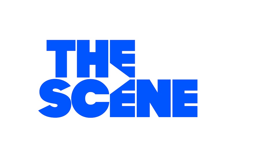
Pentagram has designed a brand identity for The Scene that establishes a stylish presence for the portal and sets the stage for the programming from the various brands. The identity centers on the graphic motif of a triangle, inspired by the “play” arrow in online video. Built into the typography of the logo, the triangle is formed in the space between the letters, inviting viewers to click and watch.
As formerly print-focused media are now producing more original video content for their audiences, their online platforms have become “channels” that rival existing broadcast networks in quality journalism and storytelling. Building on Condé Nast’s legacy as a pioneer in publishing, The Scene is the industry’s first stand-alone platform devoted to showcasing premium digital-first video content. Conde Nast’s publications have been producing videos for some time, but The Scene brings together all of this programming on one site, where the various brands are presented as individual channels. The Scene content is also available on over 25 platforms and devices including AOL, YouTube, Yahoo, Roku, Twitter, Dailymotion, as well as Condé Nast’s brand sites.
To develop the new identity, the designers worked closely with Dawn Ostroff, President of Conde Nast Entertainment, Fred Santarpia, Chief Digital Officer, and Doug Seidman, Vice President of Product and Design. The challenge was creating an identity that would work with and unify the diverse range of content and brands. The Scene features over 100 digital series across all its channels, as well as stand-alone films. Fashion tutorials from Glamour and Allure are presented alongside sports coverage from Major League Soccer and Golf Digest, documentaries from PBS and Vanity Fair, weather reports from The Weather Channel, webisodes from AOL, and “WTF” clips from BuzzFeed.
At the same time, The Scene needed an identity that emphasized the “video-ness” of the platform, which is quite different from the world of print. Pentagram worked on the strategy, messaging and tone for The Scene brand, which emphasizes the dynamic possibilities of video. The solution was a simple shape—the triangle, widely recognized as a cue for pressing “play” on digital video. The shape has been built into a negative space in The Scene logotype, where it can also serve as a window for a variety of imagery. Simultaneously strong and modern, the wordmark goes with almost anything—fashion, tech, food, sports, news—and fits in well with the world of existing logos showcased on the platform. Based on Sharp Sans No. 1 by Village, the wordmark is scalable and works at a range of sizes, important for a logo that will be used in motion graphics.
Building on the shape, the designers have created a world of triangles, expanding the “play” symbol into an iconic, forward-looking system that quickly reads as “The Scene.” Smart, witty and confident, the identity complements the cool of Condé Nast. Triangles can be combined to create other shapes or stylish kaleidoscopic patterns that hint at the groups of pixels that make up a digital image. The triangle can act as its own kind of viewfinder, filled with imagery to give a look into the worlds of the brands. (On business cards, the triangle could be die-cut to make an actual window.) Or the shape can be used as a pointer or arrow that highlights, directs, and makes connections between things.
The designers developed brand guidelines that establish the placement, movement and play of the triangles, as well as a comprehensive brand voice. A system was designed that places the logos of the existing brands in circles, a basic shape that complements the triangle of The Scene. Following the lead of the strong wordmark, typography is a key component of the program. The primary typeface is Aperçu, a sans serif typeface by Colophon; the secondary font is the serif Lyon by Commercial Type.

