London is the greenest city in Europe, and a huge part of this greenery can be found in The Royal Botanic Gardens, Kew. Founded in 1759 and declared a UNESCO World Heritage Site in 2003, Kew is the world’s largest collection of living plants, a botanical research centre and one of London’s most popular visitor attractions. Kew epitomises many aspect of what makes London unique, with its sprawling green space, its royal heritage and dedication to innovative research.
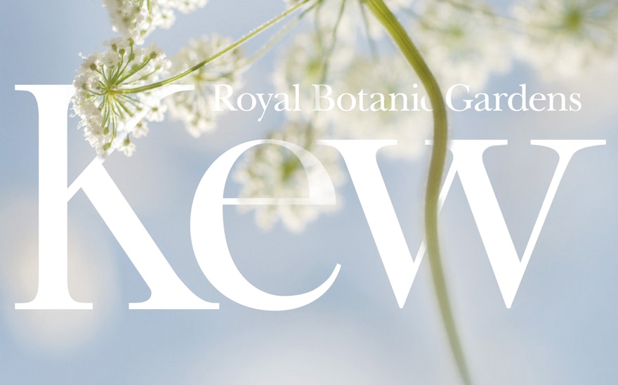
Pentagram has created a new identity for the gardens, which brings all these qualities to the fore. At the centre of the new identity is the Kew logotype. Always used with confidence and authority, it is at the heart of the brand and all its applications. The logotype is at the centre of Kew’s communications, and is always clear, expressive and used with integrity. This is seen with promotional posters, where the logo is proudly in the middle of detailed images of plants, expressing the brand’s confidence and intertwinement with nature.
The identity uses two typefaces: a customised version of Baskerville, designed in 1757, two years prior to the establishment of Kew, conveying the history and heritage of the organisation, and Franklin Gothic, the primary typeface, signalling the pioneering nature of Kew.

