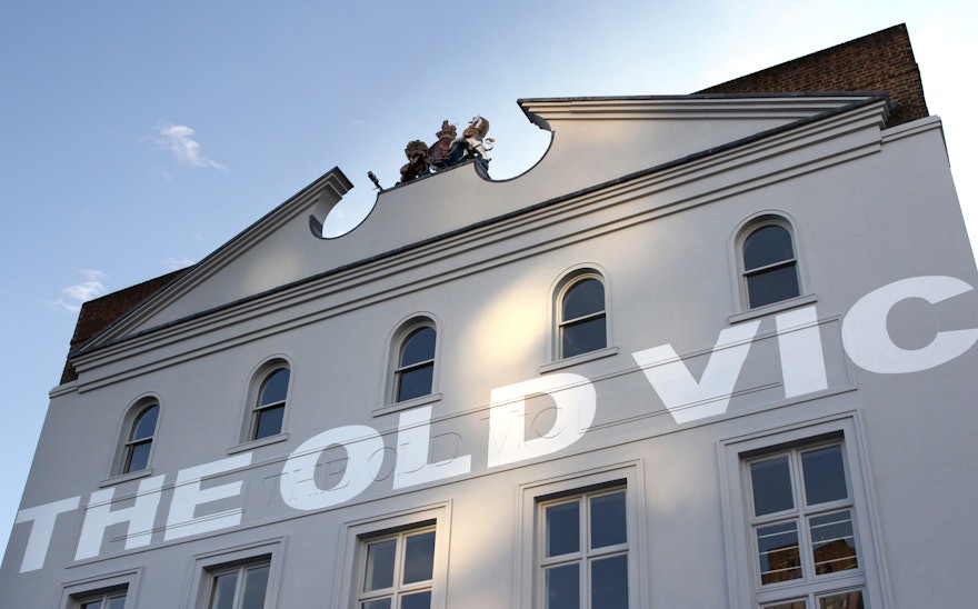
In 2016, Pentagram created a typographic and story driven visual identity for one of Britain’s oldest and best-known theatres. Two years later, Pentagram has once again teamed up with The Old Vic to commemorate the theatre's 200th birthday.
To mark the anniversary, The Old Vic's logotype has been applied to the theatre's iconic exterior, bringing Pentagram's original concept for the identity full circle.
Back in 2016, Pentagram worked closely with The Old Vic's Artistic Director, Matthew Warchus, to deliver a visual identity imbued with authenticity, born from the theatre's local surroundings, and its distinguished history.
During the initial research phase of the project, the team discovered that while the theatre's official name had changed a number of times over the course of its history, it had always been colloquially referred to as ‘The Old Vic’.
Pentagram decided to strategically orientate the theatre's visuals towards this historically-significant and locally-adored identity. Resulting in the new logotype being designed with the theatre's current moniker, rather than its original name, The Royal Victoria Theatre.
In turn, this route encouraged the team to look towards the The Old Vic's surrounding area for inspiration, which was found in the letterforms of the supersized typography that adorns the walls of many Victorian-era buildings in London.
The team noticed that this painted lettering develops a timeless, almost ghost-like quality over the course of the building's lifespan – resulting in a visual language that evokes a strong sense of time and place.
To further commemorate The Old Vic's landmark year, Pentagram has created a branded campaign, ‘The Old Vic at 200’, inspired by the language and aesthetic of posters and promotional collateral from the theatre's extensive archive.
Back in 2016, Pentagram visited The Old Vic's archive at the University of Bristol Theatre Collection. During these visits, the team visually audited many eras of poster designs – observing that the most powerful ones were pure, direct and typographic.
Reflecting this, Pentagram built a simple grid and typographic system for the the bicentenary posters, with the specially designed ‘The Old Vic at 200’ logotype running from top to bottom – no matter the scale, size or format.
The result is a pure and powerful statement of content, with bold colours being used to inject a joyful differentiator.

