Presented by the School of Visual Arts in New York, The Masters Series: Michael Bierut is the first comprehensive retrospective of the graphic designer and Pentagram partner. An in-depth survey of Bierut’s 35-year career, the exhibition is the 27th in SVA’s annual Masters Series honoring great visual communicators.
The exhibition features Bierut’s designs for identity systems, environmental graphics, books and more, from his signage programs for the New York City Department of Transportation and the New York Times Building, to his posters for the Yale School of Architecture, to his symbols for MIT Media Lab, Saks Fifth Avenue, and Hillary Clinton’s campaign. It also shares personal works from his own collection, including over 100 of the sketchbooks he uses to brainstorm his ideas. The show coincides with the publication of Bierut’s first monograph, How to use graphic design to sell things, explain things look better, make people laugh, make people cry, and (every once in a while) change the world (Thames & Hudson and Harper Design), and the look and feel of the book has been carried through to the exhibition.
Located in New York’s landmark Starett-Lehigh Building, the SVA Chelsea Gallery is comprised of four large rooms, and thankfully Bierut had plenty of work to fill the space. The designers organized the exhibition around four general areas, each of which holds special interest for Bierut: design and the city, the design process, how architecture can be represented on paper, and the search for graphic identity.
Titled “How to design for the toughest audience in the world,” the first gallery focuses on Bierut’s work in, around and for New York City—a constant source of challenge and inspiration. The room opens with a 1:1 scale model of a section of the sign he designed for the façade of the New York Times Building. (The original is made of aluminum sleeves that fit over ceramic rods; the model recreates the effect in wood.) Examples from his systems for New York’s parking signs, the WalkNYC pedestrian wayfinding, the Cathedral Church of St. John the Divine, and Governors Island are on view, along with his iconic identity and packaging for Saks Fifth Avenue.
Graphic arrows borrowed from one of Bierut’s posters for the Yale School of Architecture help direct visitors down a hall to the second gallery, which explores “How to think with your hands.” Here Bierut shares over 100 of the inexpensive composition notebooks he uses to sketch and refine his ideas, displayed together for the first time. Scattered among the minutes of meetings, records of phone conversations, and lists of phone numbers are sketches that document his thinking about design problems.
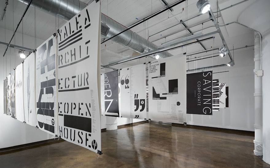
The third gallery features Bierut’s many collaborations with architects, and specifically “How to make architecture out of paper,” as the section is titled. Over 84 posters from his ongoing series for the Yale School of Architecture are dramatically hung back to back in rows from the ceiling. The installation demonstrates the remarkable flexibility of a system that is based in simple black and white, a standard size, and all type, in literally hundreds of fonts since the series began in 1998. Several vitrines contain the architecture monographs Bierut has designed over the years.
Last but certainly not least, the fourth room is called “How to make a mark” and explores graphic identity. Over 60 logos, wordmarks and symbols designed by Bierut unspool in black and white on rolls of paper affixed to the gallery wall. These are accompanied by branded products, packaging and other objects displayed on pedestals and a series of videos in which Bierut shares his thoughts on branding.

