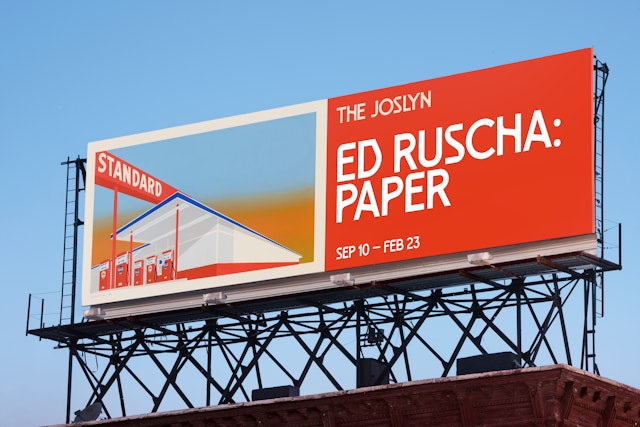
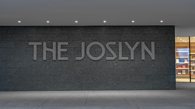
The system is unique in that it is not built around a single logo, but rather a wordmark set in custom typefaces created exclusively for The Joslyn.
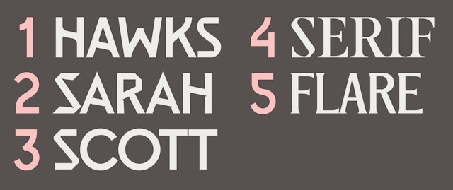
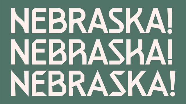

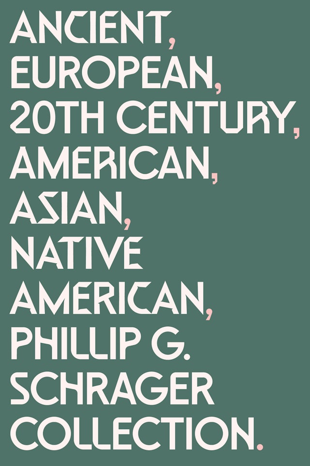
The Joslyn typefaces encompass several different variations inspired by the structures and collections of the Museum, conveying the breadth and energy of its art, architecture and programming.
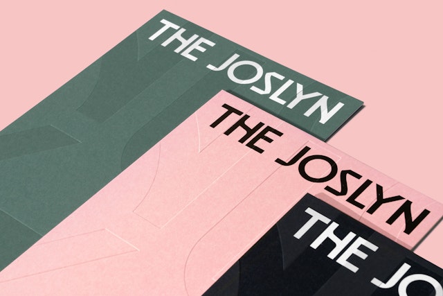
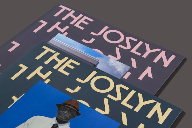
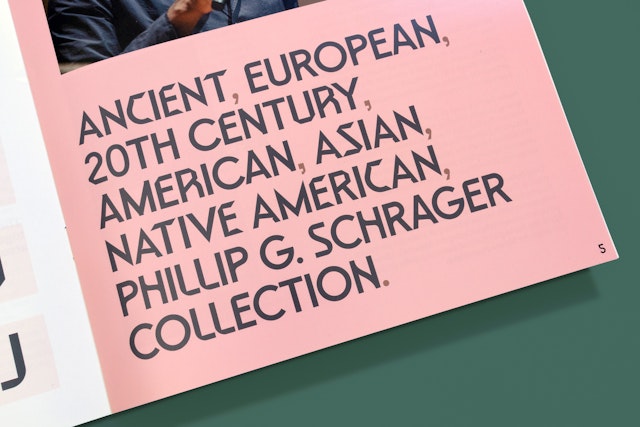
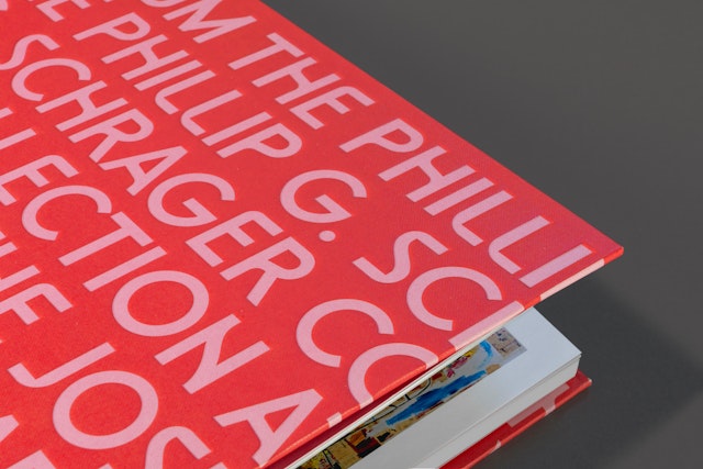
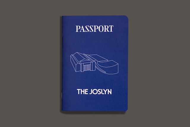
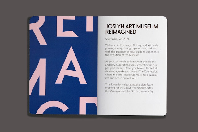
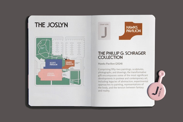
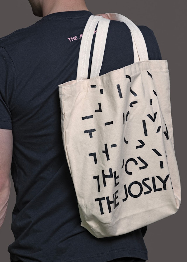
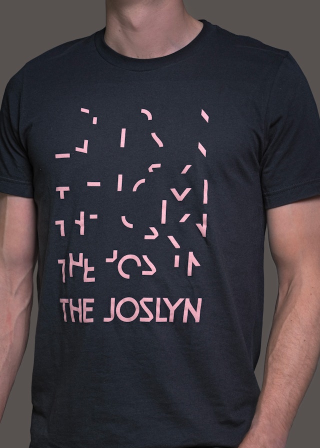
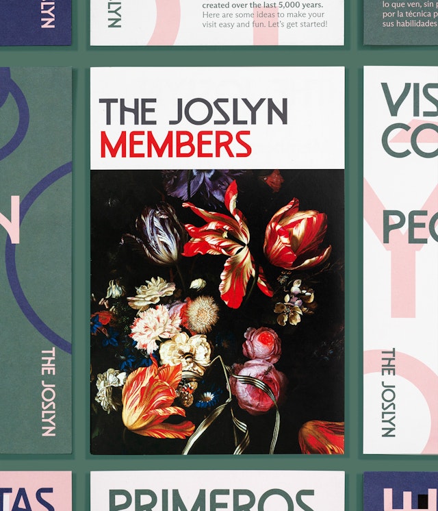
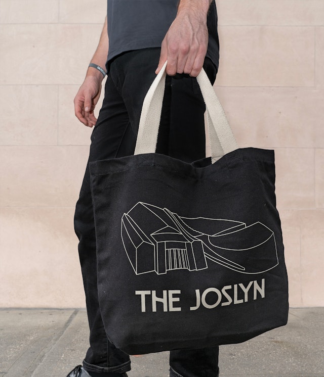
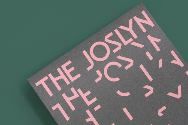
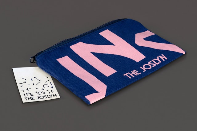
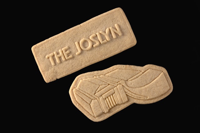
With its built-in flexibility, the dynamic identity recognizes that creative regeneration is a continuous process and allows the framework to grow along with the Museum.
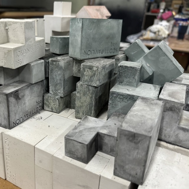
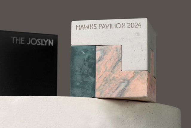
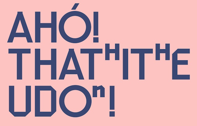
The typefaces encompass an alphabet of glyphs and phonetic characters for Umóⁿhoⁿ (Omaha) and related Indigenous languages spoken in the region.
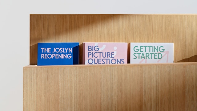
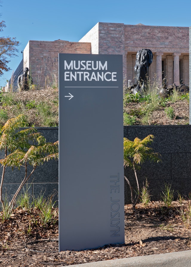
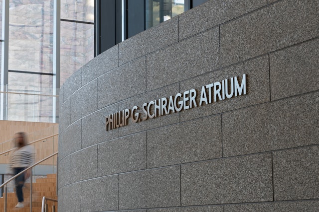
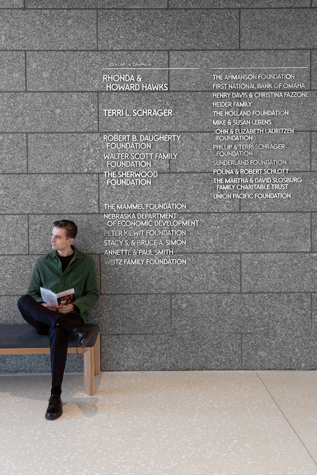
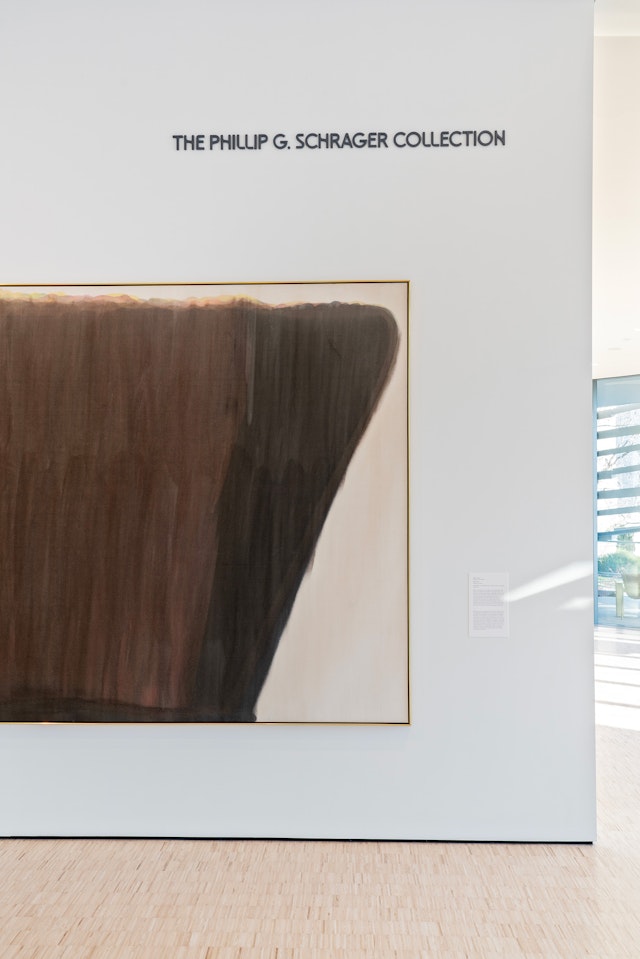
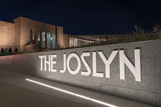
The Joslyn Museum of Art in Omaha is one the most important arts institutions in the Midwest. Founded in 1931, the largest art museum in Nebraska serves as a vital educational and cultural resource, with a collection of over 12,000 objects representing more than 5,000 years of human creativity and the world’s diverse cultures––and free admission for all, always. The campus comprises three buildings, including the Hawks Pavilion, a new 42,000-square-foot expansion designed by Snøhetta that opened in fall 2024.
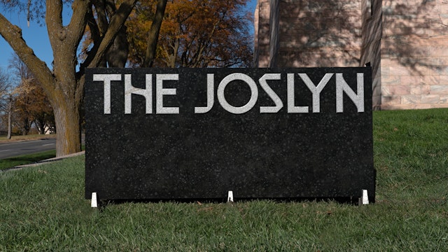
As part of the revitalization, Pentagram developed a new strategic and visual framework for The Joslyn that captures the dynamic spirit of creativity and community at the heart of the Museum. The system is unique in that it is not built around a single logo, but rather a wordmark set in custom typefaces created exclusively for The Joslyn.
The Pentagram team collaborated closely on the project with leadership at the Museum, including Jack Becker, Executive Director and CEO, and Amy Rummel, Director of Marketing and Public Relations. The framework reflects the marked changes in strategy and approach that have propelled the Museum’s growth in recent years.
“A key goal for the new brand identity was to balance The Joslyn’s equity as a beloved, stable, and historically significant institution with a renewed vision of the Museum as a relevant, progressive, accessible, inclusive, and entertaining place for a diverse audience,” says Becker. “It also leads with a new moniker, The Joslyn––the name by which so many in our community refer to us. It is less formal and suggests that we are an art museum that promises a variety of experiences and welcomes a multitude of perspectives.”
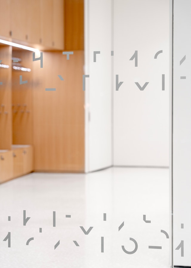
Bespoke typography is the foundation of the brand identity. Nodding to the past, present and future, The Joslyn typefaces encompass several different variations inspired by the structures and collections that comprise the revitalized Museum. The multifaceted approach conveys the breadth and energy of the Museum’s art, architecture and programming. The variations can be used on their own or combined with each other to form a distinct graphic language that is diverse, open and expressive, and always unmistakably The Joslyn.
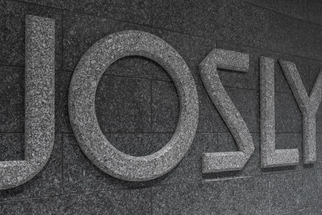
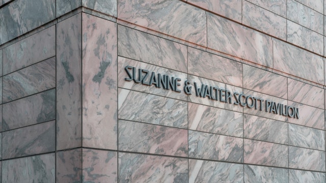
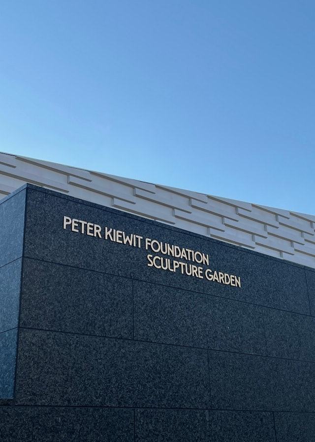
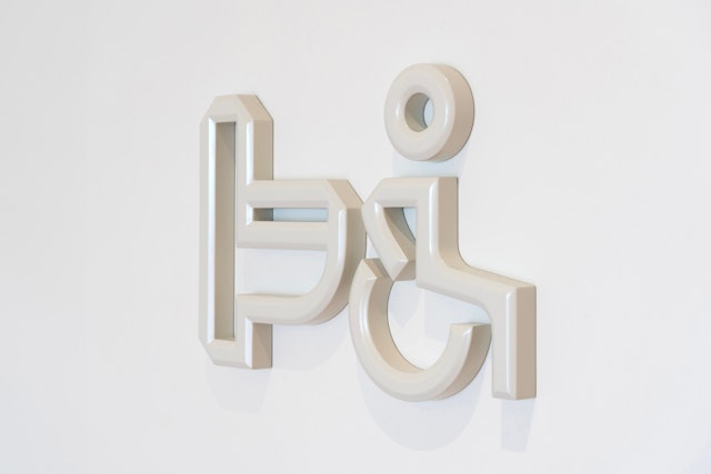
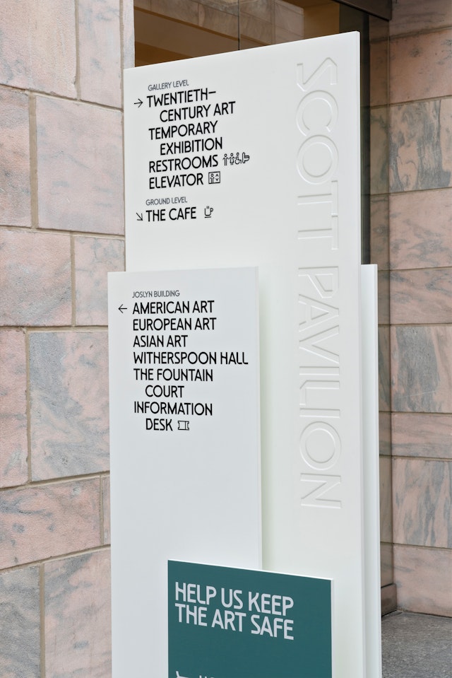
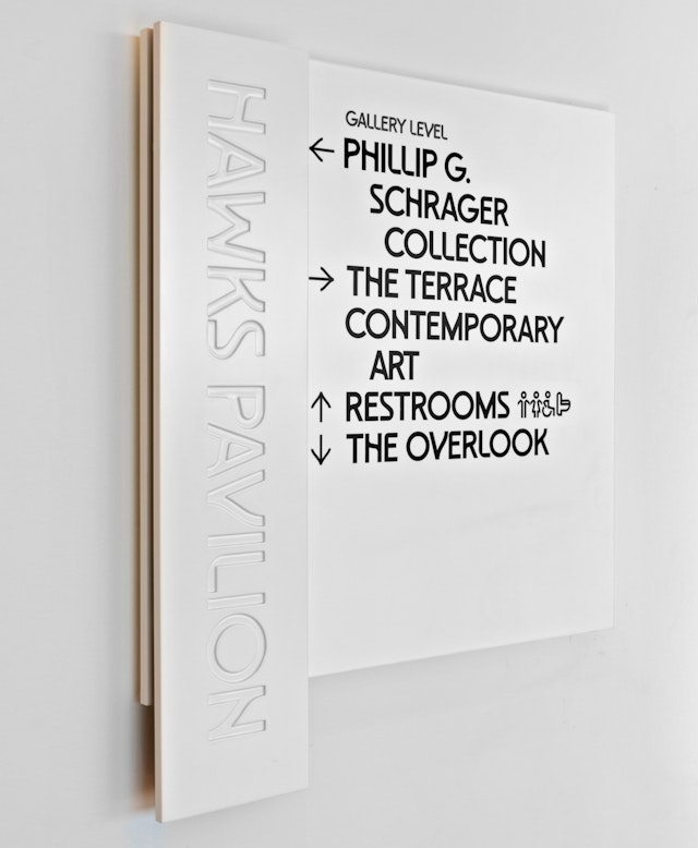
The letterforms of three variations have qualities that reflect the architecture of each building: sharp and angular for the original 1931 Joslyn Building (designed by John and Alan McDonald), with flares that evoke the hand-drawn Art Deco lettering of its entrance inscription; rectilinear for the 1994 Scott Pavilion (designed by Foster & Partners); and both rectilinear and curving for the new Hawks Pavilion by Snøhetta, whose tripartite concept nods to the earth, ground and sky of the Great Plains. Two subvariant fonts are based on genres of art in the Museum collection.
The Pentagram designers developed a full alphabet for each of the fonts. The letterforms of each vary in their angled cuts and crossbars, slight flares and sharp corners. The design can be further modified along a chronological continuum from historical to contemporary, with characteristics like serifs and flares adjusted accordingly. The typeface can be carefully calibrated to correspond to the various artworks, exhibitions and programming, depending on the context.
This built-in flexibility will allow the identity to grow along with the Museum and its community. Inclusion is integral to The Joslyn’s mission, and the typefaces encompass an alphabet of glyphs and phonetic characters for Umóⁿhoⁿ (Omaha) and related Indigenous languages spoken in this region. This font was designed in collaboration with the type foundry ABC Dinamo, who adapted the glyphs from its existing typeface Arizona.
The identity recognizes that creative regeneration is a continuous process. To develop the system, the Pentagram designers utilized a framework of “regenerative narrative”––an intentional crafting of type designs that go beyond the utilitarian purpose of facilitating communication to incorporate historical and cultural elements that make the type part of a larger forward-thinking narrative. This helps foster a stronger understanding and connection between the form and content of the message being conveyed.
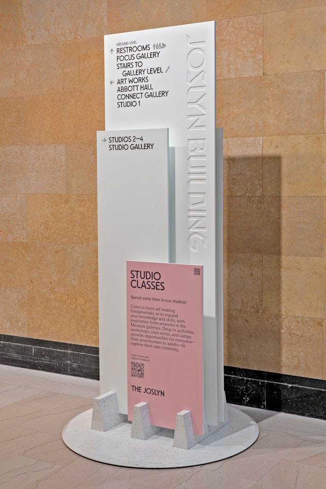
Color is an integral part of the visual system. The core palette speaks to the museum’s tripartite architecture with a warm camel brown (earth), a deep green (ground), and a medium-dark shade of cyan blue (sky). These are complemented by a pink and gray that reference the Georgia Pink marble that wraps the 1931 and 1994 buildings and is reflected in a crushed aggregate in the façade of the new Hawks Pavilion.
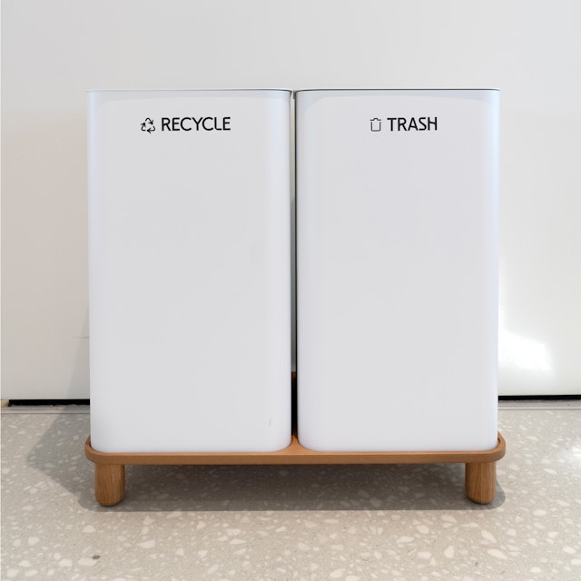
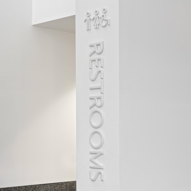
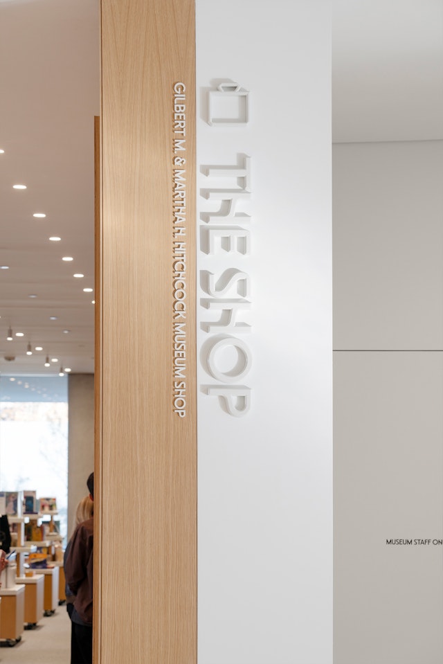
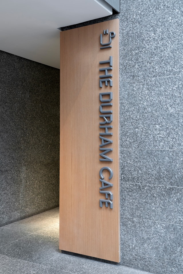
The new brand identity and typefaces are utilized in signage and wayfinding throughout the museum, in exhibition graphics, in promotional campaigns and on The Joslyn website and social media channels.
“We have found the new brand to be bold and exciting while also flexible,” says Becker. “It is complex in design, but simple in presentation to our audiences… It makes an immediate and lasting impact.”
Office
- New York
Partner
Project team
- Ruben Gijselhart
- Issabella Hindley-Cupper
- Jun Park
- Ken Deegan
- Pedro Mendes
- Tina Zhou
- Dana Reginiano
Collaborators
- Saundra Marcel, strategy
- Claudia Mandlik, case study photography
- Gerard Mallandrich, animator
- Decimal Studios, web development
- DCL, signage fabrication
