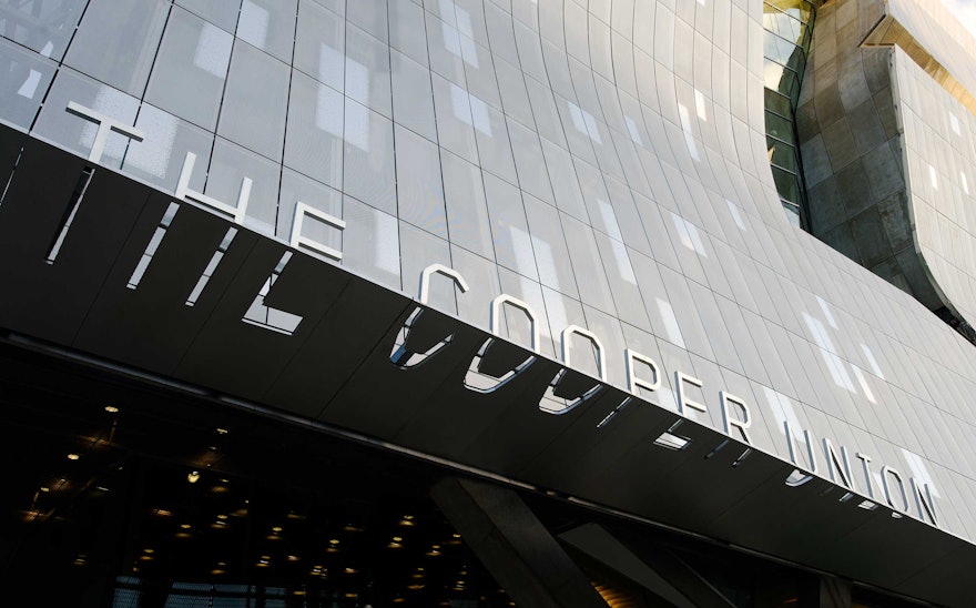
In 2009, the Cooper Union for the Advancement of Science and Art opened its new academic building on its Cooper Square campus in New York’s East Village. Designed by the Pritzker Prize-winning architect Thom Mayne of Morphosis, the building has quickly become one of the city’s new landmarks. Pentagram has designed a unique program of signage and environmental graphics for the building that is fully integrated with the building’s dynamic architecture.
The new academic building, located at 41 Cooper Square, sits directly across Third Avenue from the Cooper Union’s original 1859 building, called the Foundation building. Like Mayne’s architectural design, Pentagram’s graphics for the new building establish a dialogue with the older structure.For the signage typography the designers chose the font Foundry Gridnik, which resembles the lettering on the façade of the Foundation building. The original signage has a strong, angular look that suggests art, architecture and engineering. Gridnik also has a tough and futuristic character that makes it especially sympathetic to the forms and materials of the new building.
The signage typography has been physicalized in different ways, engaging multiple surfaces of the three-dimensional signs, appearing extruded across corners, or cut, extended and dragged through the material. The designers worked closely with Morphosis to integrate the signage into the building. The building canopy features optically extruded lettering that appears "correct" when seen in strict elevation, but distorts as the profile of the letter is dragged backwards in space. The cutouts in the lower half of the letterforms echo the transparency of the building’s surface “skin” of perforated stainless steel.
The program of donor signage is also uniquely integrated with the architecture. The lobby of the new building is a soaring sky-lit atrium that rises up nine stories through the building’s core and is dominated by staircases. A dramatic installation recognizing major donors animates the underside of a descending stairwell, the signage comprised of over 80 “blades” that cascade down the underside of the stairs, echoing the stairs’ downward motion. The typography is engraved on the front, bottom and reverse surface of each blade.
A similar typographic approach was used for a series of donor signs outside classrooms and offices. The rooms feature doors that are 10-feet high. The donor sign at each room’s entrance appears as a vertical stainless-steel bar that acts as a “corner guard” for the doors. The typography appears as though it has been dragged through the bar, so edges of the letterforms are visible on edges of the bar. When seen from the sides, these bars appear covered in patterns of black banding, another way to see letterforms.

