The Austin Museum of Art (AMOA) and Arthouse, Austin's contemporary art museum, merged in 2011 and became AMOA-Arthouse. That unwieldy name and the resulting identity, basically the two original logos shoved uncomfortably together, just added to the general confusion and misconceptions about the new entity. The museum's awkward name and logo-sandwich, the unfortunate product of a shotgun wedding, just underscored the fact that it used to be two organizations. It didn't help things that the combined visual arts institutions were housed under two separate roofs in different parts of the city. After the merger AMOA, which had been mostly downtown for several years, moved back into an old stately lakeside villa called Laguna Gloria and Arthouse stayed in the Jones Center, a modern revamped theater on 7th Street and Congress Avenue downtown. The museum's new executive director, Louis Grachos, enlisted Pentagram to help rename AMOA-Arthouse and to develop an original brand identity that expressed his ambitious vision for the new museum. The museum unveiled a new name, The Contemporary Austin, along with a sleek new look.
The designers began the project by compiling a list of every art museum name they could find. From that exhaustive survey, patterns emerged and it became clear that another acronym like MOMA, MOCA or even AMOA was not an original or forward-thinking way to go. Both AMOA and Arthouse had been promoting and exhibiting contemporary art over the years and neither had the capacity to build large collections. With that in mind the team decided to steer clear of "museum" because the word usually suggests a collecting entity. The Contemporary Austin is a simple, direct name that clearly states the focus and mission of the new institution. In the end, the new moniker represents a clean break from the burdensome histories and baggage of the previously established names and opens the door to a new day.
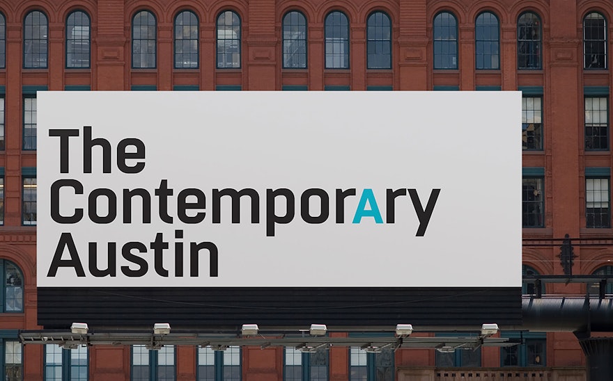
Like the name, the new identity system is built around a simple wordmark, a sans-serif typographic solution that spells out the museum's name in upper- and lowercase but highlights the "A" in the word Contemporary with a capital letter and a change of color. The simple cap A can be pulled out and used by itself as an icon in some situations, like buttons and membership stickers, and the identity system also allows for an abbreviated version of the new name, The Contemporary, that drops the word Austin altogether
The new brand identity gets its clean, modern look from a generous use of white-space and a spare, uncluttered aesthetic. A signature blue-green color that the designers named "Dani Blue" after the director's invaluable executive assistant Danielle Nieciag (who originally suggested the aqua color) matches the color of the distinctive glass-bricks jutting out of the downtown Jones Center's walls when they're illuminated at night, and also makes reference to the bluish lagoon off of Lake Austin where the Laguna Gloria estate gets its name.
One of The Contemporary Austin's goals is to commission original art from the world's leading contemporary artists and to feature their works simultaneously at the Jones Center and Laguna Gloria– and beyond. So in the spirit of Grachos' vision of a "Museum Without Walls," the first artists to show work under the new identity this fall will be British multidisciplinary artists Liam Gillick and New Yorker Marianne Vitale. Both artists, two of the most topical and challenging contemporary artists working today, were commissioned to create large-scale outdoor works to be displayed on the 12-acre grounds of Laguna Gloria and in the gallery spaces at both venues.

