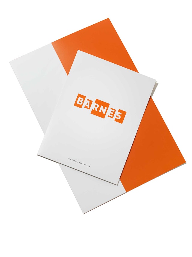
The identity applied to stationery.
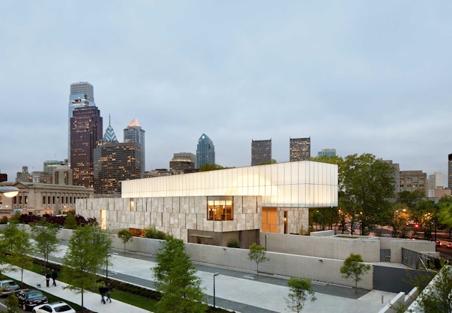
The new Barnes building in Philadelphia designed by Tod Williams Billie Tsien Architects.
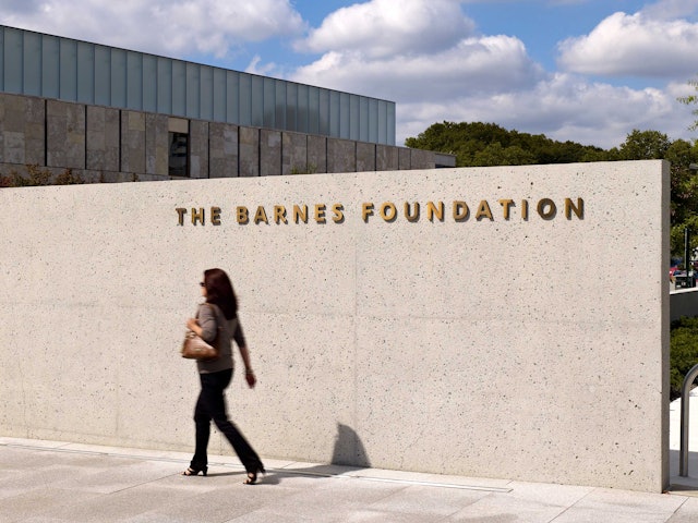
The name of the Foundation appears in metal lettering pin-mounted to the building at the entrance.
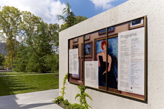
Museum information is posted on large panels at the entrance.
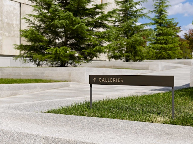
Signage directing visitors through the park to the galleries.
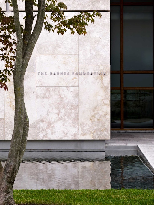
Museum entrance.
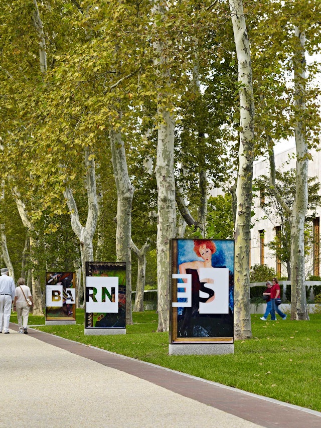
A series of processional signs are directed towards traffic on the Parkway.
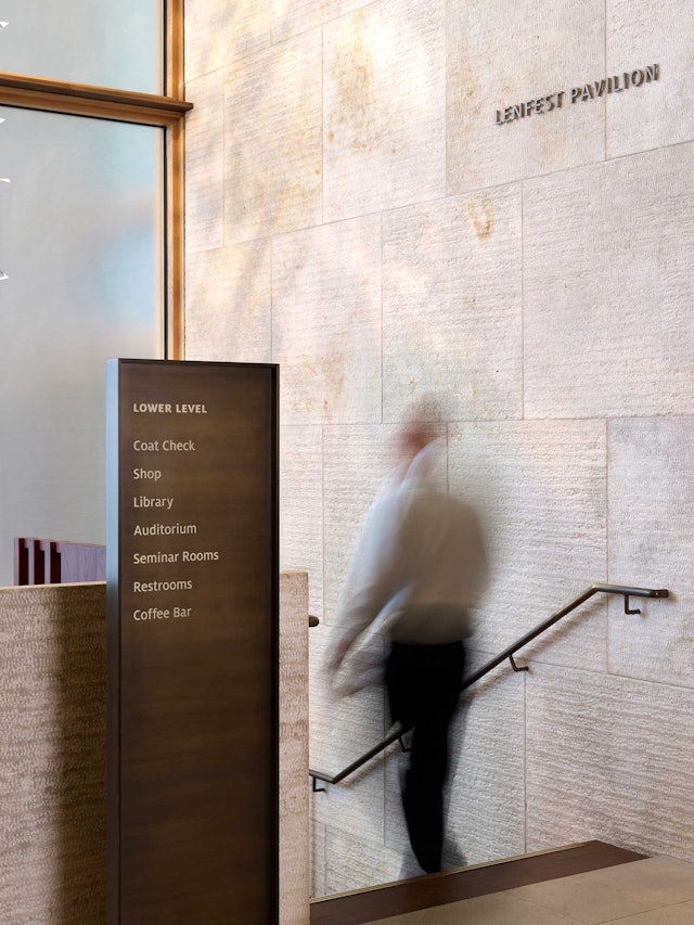
Directional wayfinding in the museum.

Donor wall in the Annenberg Court.
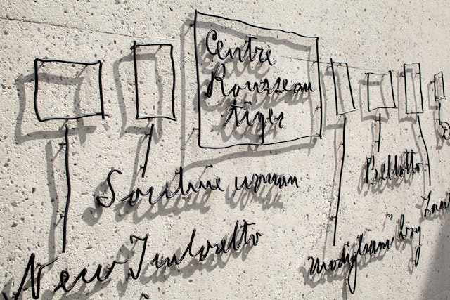
A handwritten notation by Dr. Barnes rendered in wrought iron.
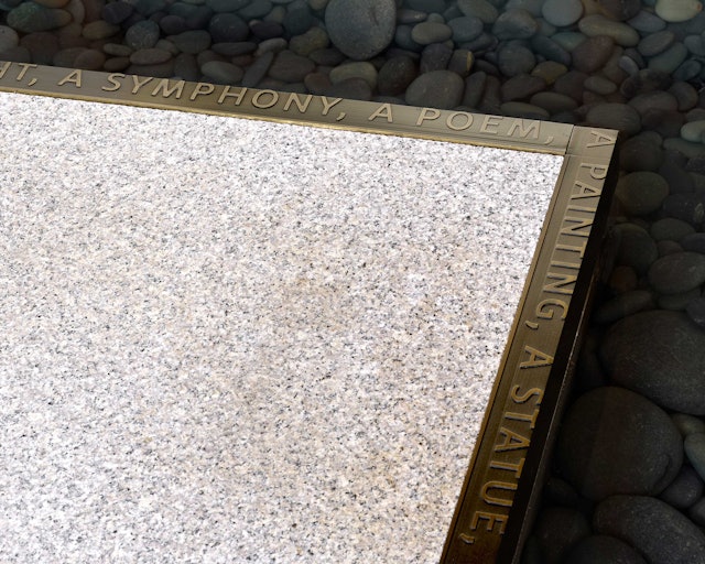
A quote from Dr. Barnes frames the edge of a fountain.
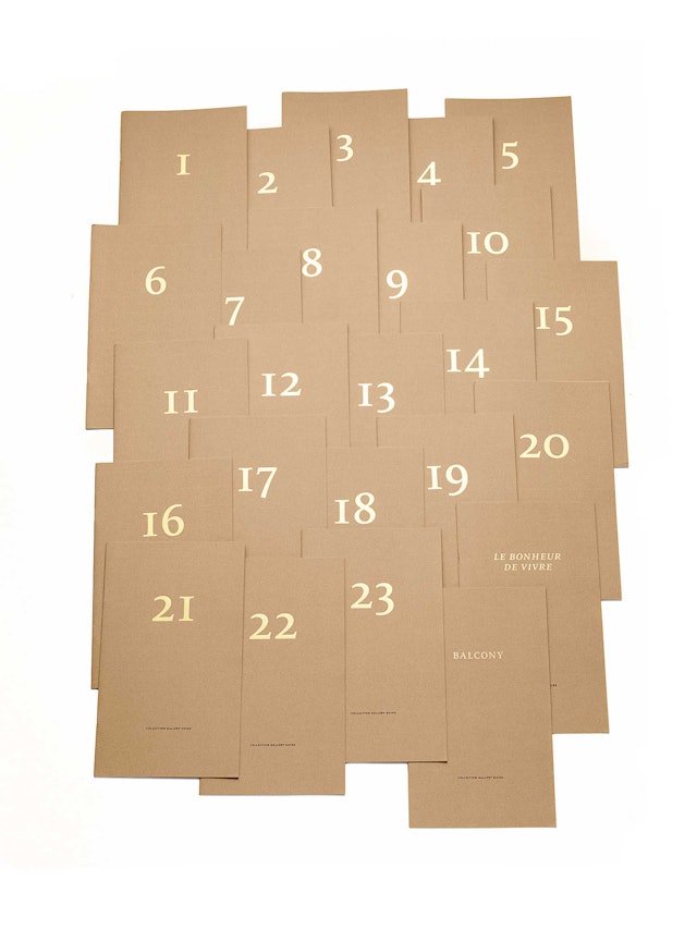
Gallery guides.
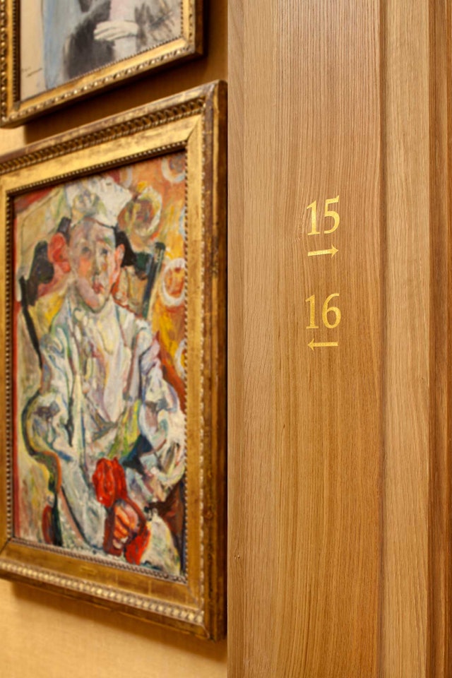
Galleries are identified by number.
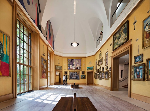
The Main Room of the Collection Gallery. Photo by Michael Moran.
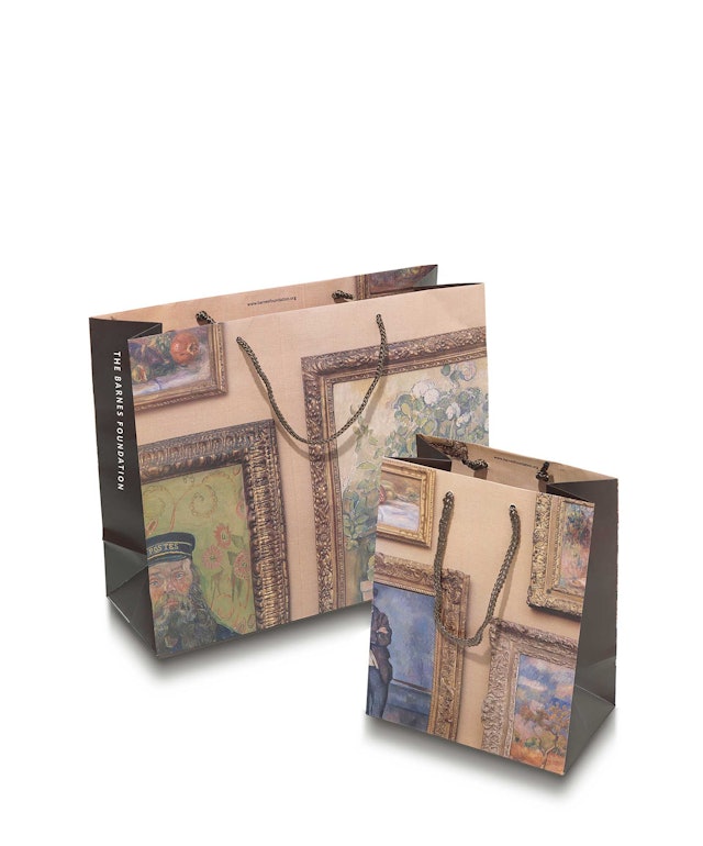
Cropped images of the ensembles are used on shopping bags.
