The new logo.

The new logo can be used in different configurations.
1 The new logo. 2 The new logo can be used in different configurations.

Table of contents. Various typefaces are used to differentiate sections and subject matter.

Opening spread of an essay by Suzy Hansen in the Salvos section. Photograph by Lindsay Ballant.
1 Table of contents. Various typefaces are used to differentiate sections and subject matter. 2 Opening spread of an essay by Suzy Hansen in the Salvos section. Photograph by Lindsay Ballant. 3 Opening spread of an essay by Robert Westbrook. Typography by Jessica Hische.

Opening spread of an essay by Robert Westbrook. Typography by Jessica Hische.

Opening spread of an opinion piece.

Short stories appear on sky blue pages.

The magazine’s grid has been redesigned for greater flexibility.
4 Opening spread of an opinion piece. 5 Short stories appear on sky blue pages. 6 The magazine’s grid has been redesigned for greater flexibility.

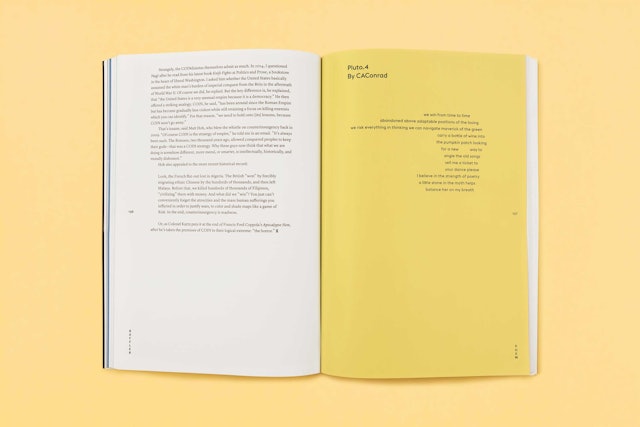
Poetry appears on yellow pages.

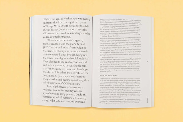
Type size can be blown up to grab a reader’s attention.

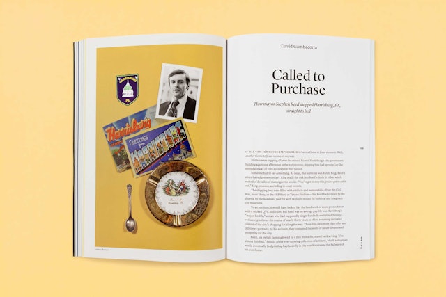
Opening spread of an article by David Gambacorta. Photo-illustration by Lindsay Ballant.

Website.

The new website design echoes the experience of the print journal.
1 The new website design echoes the experience of the print journal.


