The designers worked closely with Sanderson to interpret the data, transforming information from Excel spreadsheets into precise, intricate infographics that are carefully crafted to enhance understanding of the topic at hand.

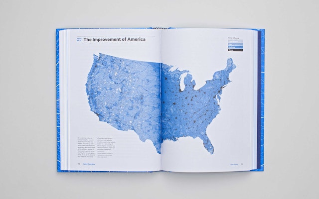



The US spends roughly $1 billion a day overseas on foreign oil instead of investing the funds at home, where the economy badly needs it. At the same time, our dependence on oil from unstable countries endangers national security, and carbon dioxide emissions from burning oil contribute to climate change. In Terra Nova: The New World After Oil, Cars, and Suburbs, the scientist Eric W. Sanderson looks at how three powerful forces that drove American prosperity for the better part of a century are now detrimentally affecting the country's quality of life. The book is a sequel of sorts to Mannahatta, Sanderson’s reimagining of what the island of Manhattan was like before the first settlers arrived. In Terra Nova, he looks ahead, and with a larger scope, envisioning what the US would be like if our dependence on oil, automobiles and urban sprawl were to end, and a new ecology was formed that valued the land, encouraged well-designed cities, and depended on America’s natural advantages in resources like wind, sun and heat, as well as ingenuity.
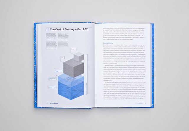
Pentagram has created a design for Terra Nova that helps the book make its case through a clear, cogent layout and a series of 72 highly detailed diagrams. Sanderson’s writing is smart, creative and lively, and the designers have developed a corollary in engaging, user-friendly information graphics that complement the highly readable text. More than supplemental illustrations, the data visualizations are a key element of the book, helping Sanderson construct his arguments and communicate his vision.
Pentagram was brought on board by the book’s publisher, Abrams, one of his longtime clients. Sanderson, who is Senior Conservation Ecologist of the Wildlife Conservation Society, knew Pentagram well: Mannahatta was designed by Pentagram in 2009. Terra Nova is intended for a mainstream audience beyond the scientific community, and Pentagram's recent designs for books like Water Matters and Geothermal Heat Pump Manual, both published by the New York City Department of Design and Construction, have specialized in making dense technical information accessible and easy to use.
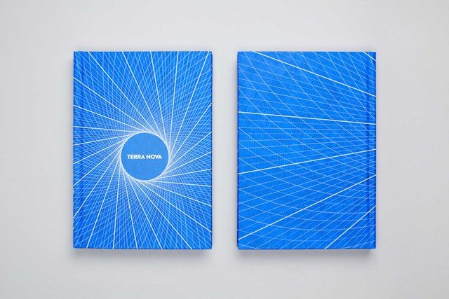
The publisher wanted packaging for Terra Nova that would help it fit into the non-fiction “friendly science” category that is so popular with readers. The marketing of these titles seems to demand a stark white bookjacket offset by small, simple, recognizable object. (See any of Malcolm Gladwell's bestsellers, or Al Gore's An Inconvenient Truth.) The designers wanted to do something more distinctive that presented Terra Nova as a true outlier. The book is sold with the requisite white jacket (here sporting a small green leaf), but the “real” cover underneath is bright blue and features a technological vortex of lines that leads the reader to “Terra Nova.” The design is more eye-catching than the banal jacket and immediately signals the book's futuristic point of view.
The data presented in Terra Nova all comes from public sources, but required extensive shaping to tell a cohesive story. The designers worked closely with Sanderson to interpret the data, transforming information from Excel spreadsheets into precise, intricate infographics that are carefully crafted to enhance understanding of the topic at hand. The designers had to build and tailor each diagram to exacting specifics, sharpening the focus of each data set while advancing the theses of the book as a whole. At the same time, the infographics are extremely straightforward, displaying no real bias themselves on highly charged subjects like oil and climate change. (The information in the book is as up-to-date as possible, and the team found itself making last-minute adjustments to reflect statistical accuracies.)
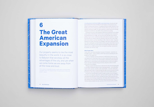
The wide variety of diagrams adds visual depth and texture to the book. Many of the diagrams are data-driven and appear in traditional configurations like graphs, technical drawings, tables, bar charts, histograms, flowcharts, maps and schematics, while others take on more unusual, creative forms that reinforce the conceptual themes of the book. The sans serif font Calibre is used for diagrams and the book’s headers and titles; text is set in the serif font Tiempos. (Both fonts are designed by Kris Sowersby.)
“For me the main goal of the design was to show people the data, but in an accessible and friendly style,” says Sanderson. “The oil-cars-suburbs story that lies at the core of the book (and 20th century America) is both more subtle and more interesting than most people know. I think the book works well to draw people in, help them understand, and then act to make a new world (Terra Nova).”
The book is divided into three parts. In Part I, “The Siren’s Song,” Sanderson starts his story in the first person—he himself grew up in the suburbs, and still has a car—before widening his focus for a detailed history of how the country became dependent on oil, and how oil, cars and suburbs became part of our national identity, embedded into our cultural DNA. (The title is inspired by Homer’s Odyssey, with oil cast as the “siren.”) The section opens with a conceptual illustration that shows the reciprocal relationship of oil, cars and suburbs in intertwining strands that flow around the chain of a DNA molecule.
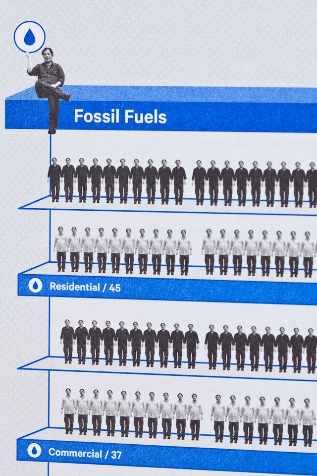
“What Flows From a Barrel of Oil” is arranged as a flowchart; in other diagrams, simple line drawings help describe subjects like the ancient organisms that formed the basis of oil and the first combustible engines. Several of the infographics integrate dimensional images to make the diagrams more engaging and entertaining, a strategy Pentagram employed in Water Matters and the Geothermal Heat Pump Manual. For a chart of “Energy Use in America,” human figures—including Pentagram staffers—appear as the 274 “energy servants,” or units of fossil fuels, nuclear energy, and renewable sources, that powered the life of the average American in 2011. Here the design helps recast energy use in terms of human effort, creating context and making the information more relatable.
“I’m particularly fond of the ‘What Flows from a Barrel of Oil’ figure,” says Sanderson. “I also love the iconic details on some of the graphics about energy density, the first automobiles, and how pumped storage works.”
In Part II, “Terra Nova,” Sanderson reveals his plan for reinventing the American way of life to sustain prosperity. His vision includes creating denser cities to replace inefficient single family homes and help save our land, changing “roads to rails” for more democratic transportation, and exploiting the potential of renewable energy sources that depend on America’s advantages in wind, sun, and heat. The section is introduced with an elaborate diagram of a “smart grid” for energy that travels in two directions, allowing everyone to be both a consumer and producer through sources like solar panels and wind power.
The third part of the book, “Ramifications,” looks at the collateral benefits after the country transitions into Terra Nova, such as better health, more resilient economic growth, and improved national security. The book wraps up with an extensive appendix of notes, sources and elaborations, presented on light blue pages to distinguish it from the rest of the volume.
“The book was a huge challenge for everyone involved, myself included,” says Sanderson. “The scope is huge, the data presentations complex, and the outcomes counter-intuitive, yet simultaneously this is a book written for my mom and dad. It was terrific to have the Pentagram team working with me to create something I’m very proud of.”
