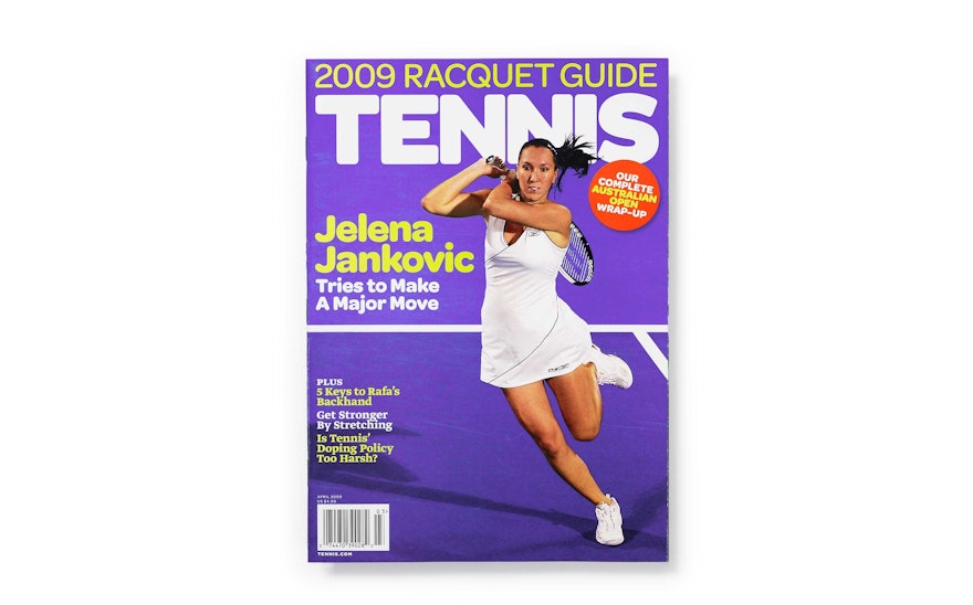
Drawing from the visual language of three decades past, the designers merged it with sporty, bright and youthful colors, alongside bold photography, to give Tennis a more contemporary look that would still appeal to its established audience.
Learn more about the project
