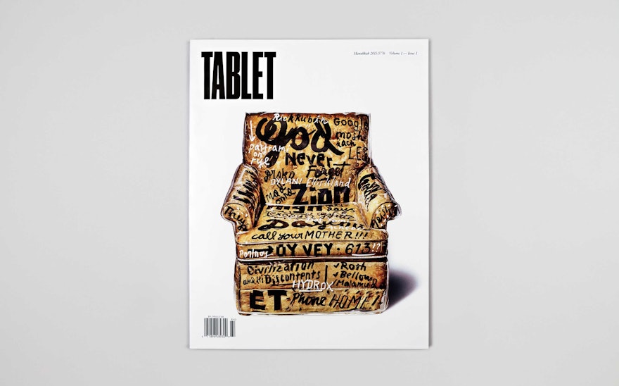
Founded in 2009, the award-winning online publication Tablet explores Jewish life and culture in all its diversity. Now, in a reversal from the traditional print-to-web publishing model, the website has launched a new stand-alone print edition that publishes original long-format original pieces, photo essays, and more. Pentagram created a design for the magazine that captures its smart, sophisticated and wide-ranging take on the Jewish experience. Scheduled as a quarterly, Tablet the magazine debuted its first issue last winter to coincide with Hanukkah, and the second issue has just been released in time for Passover.
The designers collaborated closely on the creative direction with Tablet editor-in-chief Alana Newhouse and team. The editors shared a view that contemporary magazines are increasingly, and distressingly, corporate and anodyne, designed for mass audiences and their attendant advertisers, with all the interesting quirks ironed out. The team wanted Tablet to get back to the idea that a magazine could be produced for a very specific audience and voice and feel impassioned, human, personal and real. At the same time, Jewish life and identity are far from homogenous, and the magazine needed to make room for different perspectives and a variety of ideas related to the Jewish experience.
For inspiration, the designers and the editors looked at eclectic influences like Nova, the pioneering British magazine from the 1960s; classic Interview from the 1970s and 80s; the collage-like approach of Pushpin Studios (Pushpin co-founder Seymour Chwast contributes new illustrations for the Tablet table of contents); and unusual sources like temple newsletters. The resulting design is deliberately messy and ephemeral, unpredictable and experimental, with a funky, downtown feel that is simultaneously accommodating, accessible and highly specific.
The content spans high and low, from the eccentric to the serious, and comes from an impressive mix of contributors. Features in the first two issues include an article by the film director Brett Ratner about the cultural impact of Miami Beach Jews; a profile of the New York magazine art critic Jerry Saltz—illustrated with portraits of Saltz by artists he has critiqued—and an in-depth look at the New Wave filmmaker Jean-Pierre Melville, translated from the original French.
The magazine embraces print as a medium for what can’t be done elsewhere, including visually led pieces that incorporate contemporary art, illustration and photography. (The designers brought in the photography editors Stauss & Quint to consult on an on-going basis.) The covers are specially commissioned artworks; for the launch issue, the designer James Victore hand painted typography on a plastic-covered easy chair, a stereotypical fixture of a Jewish-American home. The cover of the Passover issue features the photograph “Modern-Day Joseph,” created by a photographer who wishes to remain anonymous.
Photo essays are an essential ingredient, an image-driven corollary to the long-form writing. The first issue features a portfolio of images by the photographer Kitra Cahana of her father, a rabbi who suffered a stroke and can no longer speak. Issue #2 features “Gates of Heaven,” a photo essay by Eli Singalovski that shows security measures at synagogues around the world. The piece is introduced by a die-cut page with bars that partially reveal the photograph of a synagogue beneath and, when the page is turned, overlay a map of Europe on the opposite page, symbolically putting the continent on lockdown. Illustration is also highlighted in pieces like an article that discusses the Japanese phenomenon of the story of Anne Frank being reimagined as teenage manga.
The regular front-of-book columns include the Bulletin, a look at “news for Jews” from around the world; “The Ten,” a discussion by 10 Jews about a topic (the format is inspired by a minyan, the quorum of 10 Jewish adults required for a prayer and other religious obligations); and “Object Lessons,” a personal remembrance about an item emblematic of Jewish-American life. Back-of-book sections include the Culture Pages, a critics section that covers arts and literature; “Sunrise, Sunset,” featuring life milestones like weddings, bar mitzvahs and anniversaries, contributed by readers; and “Not Jewish,” an essay about things that a given writer feels to be most definitely “not Jewish,” for better or worse. In the current issue, the writer Gary Shteyngart contributes a humorous look at shaving; in the next issue, Howard Jacobson writes about flat-front trousers.
The quirky sensibility is carried throughout in unusual type choices and a truly liberated grid. To accommodate long stories that can run up to 20,000 words, the design employs the tightly spaced layouts of traditional newspaper columns, but otherwise every feature is different. The font families Aldine 721 BT and Figgins Sans are used for text and captions; custom treatments and display fonts are used for feature titles and department names, including type inspired by unexpected vernacular and period sources, such as the signage of a Jewish deli. The masthead logo is set in the sans serif Druk, but a new logo will debut with the third issue, out this summer. The new logo uses Elements, a font designed by Alvin Lustig that was recently rediscovered and revived by Elaine Lustig Cohen via a successful Kickstarter campaign. The fleeting logo update reflects the fearless attitude of the magazine and its editors, who reject the notion that such a change would be "bad for the brand," a common mantra of corporate publishers.
The ephemeral approach extends to the feel of the pages themselves, which are printed on a lightweight paper stock reminiscent of vintage magazines, a departure from the heavy thickness of modern high-end magazines. Covers are printed on gloss uncoated paper stock.
Subscribe to Tablet here.

