For more than 30 years, the writer and educator Susan S. Szenasy has led the charge for ethical, sustainable and human-centered design. As editor in chief of the groundbreaking magazine Metropolis, Szenasy has guided and influenced generations of designers, architects, builders, manufacturers, journalists, educators and students. Szenasy, Design Advocate (Metropolis Books) is the first published collection of Szenasy’s writings. Edited by Ann S. Hudner, Akiko Busch, and Angela Riechers, the book includes editorials, reviews, stories, profiles, presentations, lectures, addresses, and even tweets. Pentagram has created a design for the book that conveys the revolutionary point of view of Szenasy's writing and advocacy.
The designers worked closely with Szenasy and Metropolis Books publisher Diana Murphy on the design of the book. The design for the new collection is a riff on Eastern European graphics, a reflection of Szenasy’s own background—she immigrated from Hungary in the 1950s—and the radical perspective of her writing. Metropolis was launched in New York in 1981 and Szenasy took over as editor in 1985, during a highly charged political period when design and architecture was seen as a tool of corporations and developers, if at all. The collection is appropriately subtitled “Design Advocate”: with Szenasy’s guidance, the tone of conversation around architecture and design has become more serious and human-centered.
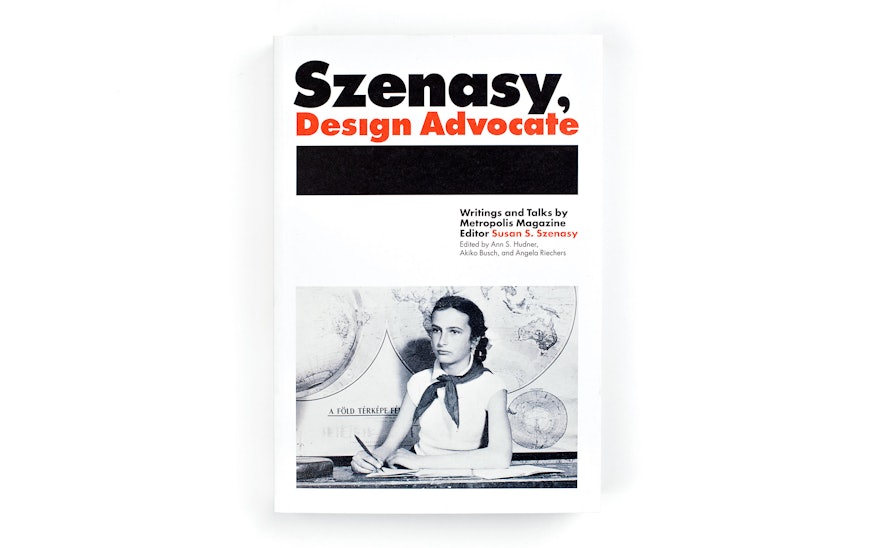
The cover features a striking photograph of a young Szenasy in the sixth grade, taken a few months before the Hungarian Revolution. Pentagram selected the portrait for the cover because Szenasy already looked so much like a young intellectual and rebel: the image perfectly captures the passion and determination Szenasy would later bring to her writing and advocacy.
The title has been treated like a magazine masthead or logo. The book is set in Futura, and the title appears in a customized Futura Extra Bold that reduces the heights of all ascenders and descenders (and eliminates the dot of the “i”) to keep the typography tight.
The book is designed in black, white and red, with two color sections of personal photographs and landmark Metropolis covers. A thick black rule is used as a graphic device throughout the book, underlining the title typography on the cover and section openers and chapter titles inside. The heavy, architectural form of the rule ties into the subject and suggests the importance and urgency of Szenasy’s work. Perspectives on Szenasy’s career and legacy from architects, designers, and journalists are identified by a red rule.
It was especially important to Szenasy and Metropolis Books that the book be environmentally sustainable. The trim size was chosen to minimize waste and the paper (Cascades Rolland Enviro Print) is made from 100% post-consumer waste fiber. The advantages to the environment are detailed in an “energy analysis” at the back of the book.

