In September 2018, Starbucks opened their first store in Milan: a Reserve Roastery located inside the historic Poste building in Piazza Cordusio. Arguably the most beautiful Starbucks store to date, the new Milan Roastery is designed as an homage to the Italian espresso culture that inspired Howard Schultz 35 years ago to create the Starbucks experience as we know it now.
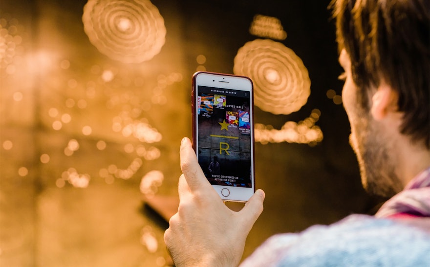
Prior to joining Pentagram, Giorgia Lupi and her team at Accurat designed a massive, augmented-reality-enabled brass wall depicting Starbucks' history and coffee-making process. The installation is the centerpiece of the store: a floor-to-ceiling, wall-to-wall visual representation of Starbucks history and its coffee, engraved in brass by local craftsmen. The team also designed and developed an interactive experience through an AR app that visitors can use as a magic lens to discover three-dimensional animations and additional content embedded in the wall.
The opening of the Milan Roastery—the third in the world, after Seattle and Shanghai—represents a full-circle moment for both Howard Schultz and Starbucks. Offering locally roasted, small-lot Arabica coffee sourced from thirty countries, and freshly made, artisanal food from local baker Rocco Princi, the U.S. coffee chain’s entry into the Italian market is a big deal for Italians. To communicate Starbucks’ story and how the vision for Starbucks came about during a visit to Italy by Schultz in 1983, the designers had the honor of working alongside Starbucks’ executives and the team of architects and artisans (who spent more than six months on the design and renovation) to create a floor-to-ceiling, engraved-brass data visualization wall that we enriched with the addition of a digital layer interacting directly with the physical space.
The wall can be read through three overlapping and interplaying layers: the story and journey of Starbucks, the meaningful places in the company’s history and the actual coffee blends. Each layer of information is embedded in the wall, leveraging the potential offered by different etching, engraving, and brushing techniques—as well as the lighting—to create a landscape that is both cohesive and multi-faceted. A dense and granular visualization presents a main narrative (Schultz’s journey and the story of how, right in this piazza, he fell in love with the Italian coffee culture) over additional datasets that provide context and evoke secondary stories.
The team also conceptualized, designed and developed the Starbucks Reserve Roastery Milano app, adding a digital layer that interacts directly with the physical space. Throughout the Roastery, the physical environment is complemented by an interactive augmented reality experience, inviting customers to uncover more about Starbucks Reserve coffees, the roasting process, and the company, using their mobile device. Thanks to augmented reality, the wall is turned into a living artwork, providing access to extra content such as videos from farms and roasteries, information on the history of Starbucks, and information on coffee culture from around the world.
Content is experienced in an immersive and visual way in the AR view, and information is gathered through exploration, allowing curious users to access more detailed information about the content in the engraved wall.
During the process of design and creation of the brass data wall, the team faced many technical challenges; perhaps the most interesting was working with a unique material that was going to be carved, perforated, and polished by local artisans according to our specifications. Several small samples of brass tiles were prototyped, which the team engraved, inked, and processed with different techniques in order to find the best way to layer the visual elements of the artwork. The legibility and position of the elements were iteratively tested by hanging a 1:1 vinyl print onsite, and we monitored the production and placement of the panels, frequently visiting the fabricator and the Roastery worksite.
Turning the brass wall into a giant AR marker to activate the digital experience was another interesting challenge: the material was backlit, and its strong reflections and curved surfaces made image recognition techniques hard to use. The designers carefully studied the positions from which customer would use the app to understand the sections framed by the smartphone camera. They then identified the most recognizable and unique elements of the visualization, and ultimately calibrated the size and aspects of the visual markers and divided the wall into different sections to achieve seamless 3D tracking of the surface.

