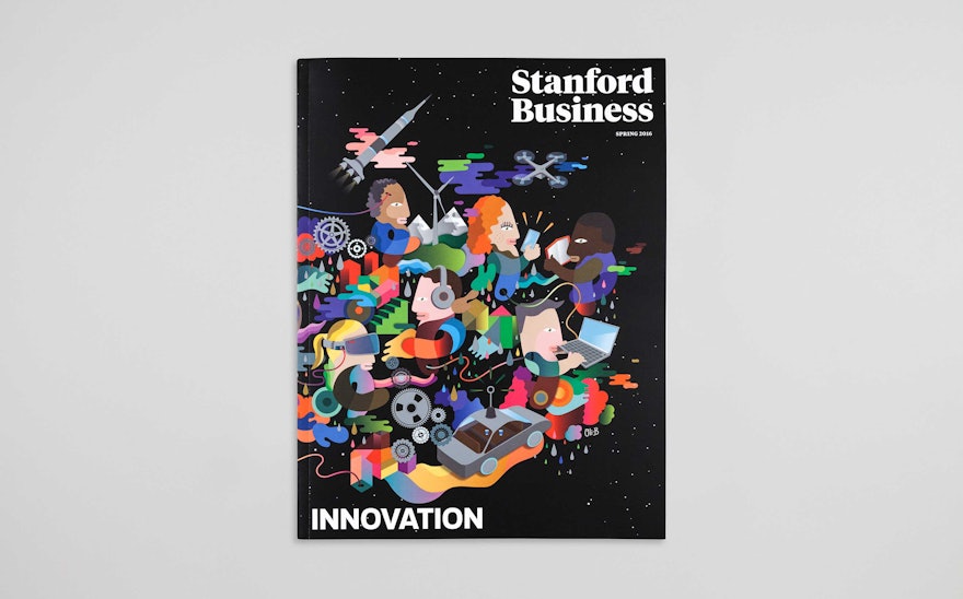
The Stanford Graduate School of Business is one of the most prestigious MBA programs in the world and is currently ranked as the No. 1 business school in the United States by U.S. News & World Report. (It shares the top spot with Harvard.) Located in the heart of Silicon Valley, Stanford GSB is part of a community that includes many of the world’s most forward-looking companies, and the school has an ambitious vision of business as a force for social good. Pentagram redesigned Stanford Business magazine, the quarterly alumni publication, with a new format inspired by Stanford's commitment to innovation.
The designers worked closely with Stanford Business’s editor-in-chief Michael Freedman to develop the redesign. Freedman joined the publication from a background in news journalism, and true to the school’s mission, has re-imagined the alumni magazine with a format that is lively, engaging and impactful, and helps connect GSB to the world at large. The first issue of the redesign was launched in Spring 2013.
The new Stanford Business is designed to stand out with a distinctive look and feel. The dimensions of the magazine are slightly smaller than the existing format, making it more unique. The standard magazine sections—the front-of-book, departments and columns—have been eschewed for a structure inspired by the school’s motto: “Change Lives. Change Organizations. Change the World.” Articles and features are organized in three sections, “Lives,” “Organizations,” and “World,” which cover the various scales of business and how it is integrated into society. The look is bold and colorful, with a palette loosely based on the school’s new identity. Stanford is renowned for the beauty of its campus, and the design of the magazine is bright, clean and airy, as a way to evoke the quality of light of the California coast.
Each issue of the quarterly centers on a specific theme, like “Reinvention,” which was timed to the magazine’s relaunch, or “Balance,” the focus of the new issue. The covers interpret these themes in illustrations that are modern, positive and colorful. The themes are the only cover lines, and also appear “hidden” on the fore edge of the issue.
The content is wide-ranging, and most articles are short—only two to four pages in length—and include material repackaged from the magazine’s website. To accommodate these articles of varying length, the design uses a less conventional “stacking” grid rather than the traditional hanging grid. The columns echo the forms of business bar graphs, with bodies of copy rising or growing as needed to fill the space. The principal serif typefaces are Tiempos Headline and Tiempos Text, and Galaxie Polaris is the sans serif font. GrotzecCond is used for drop caps.
Images play an integral role in the redesign, and many articles open with visuals, rather than text. The designers worked on the project with consulting photo editor Ayanna Quint. The photography has been carefully edited for impact, and where possible, images of the campus or California locale are used to help reinforce the sense of place and connect to alumni readers. The photography is balanced by strong illustration that helps create a smart and contemporary tone.
Each issue is published in two versions: one that closes with a “Class Notes” section of alumni news; the other without, for a wider readership. The “Class Notes” section is introduced with a historic photograph from the magazine’s archives, followed by “Who, What, Where,” a double-page infographic that presents a map of the world with alumni news pointed out in various locations, and a run of figures (“By the Numbers”) that tie into alumni accomplishments. Another feature, “From the Archives,” reprints historic ephemera from the magazine’s past.
The magazine’s back page features “Exchange,” a monthly roundup of brief quotes from alumni, professors and visiting lecturers that tie into the theme of the issue. Versions with the “Class Notes” section wrap up with “Town Square,” which asks current students questions related to the theme.

