The logotype shifted from a Gill Sans-based sans serif to the serif font Mercury for a sharper look.

The new Sotheby's wordmark.
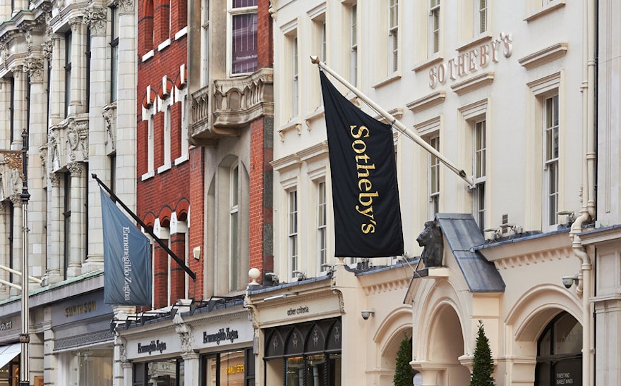
1 The logotype shifted from a Gill Sans-based sans serif to the serif font Mercury for a sharper look. 2 The new Sotheby's wordmark. 3 The program includes signage and environmental graphics for Sotheby's locations around the world.

The program includes signage and environmental graphics for Sotheby's locations around the world.

Catalogue typography appears in the font Benton Sans.

Interior layouts are clean and minimal, with object images silhouetted against white.
1 Catalogue typography appears in the font Benton Sans. 2 Interior layouts are clean and minimal, with object images silhouetted against white. 3 The catalogues are important selling tools and also function as an archive of Sotheby's auctions.

The catalogues are important selling tools and also function as an archive of Sotheby's auctions.

The magazine looks at Sotheby's activities in the context of the international art scene.


