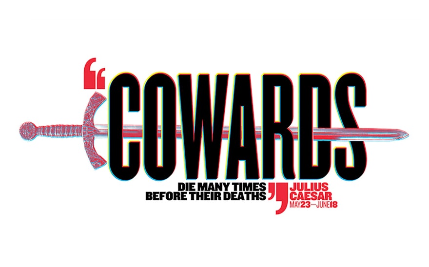
A timely new production of “Julius Caesar” kicks off the 2017 edition of Shakespeare in the Park, the annual free performances presented by The Public Theater at the Delacorte Theater in Central Park. Pentagram, working in collaboration with Kirstin Huber, art director at the Public, has created the promotional campaign for the season, which combines striking images and quotes from the play that resonate in the current political era.
This year’s campaign is Pentagram's 23rd since 1994, but is the first to break the season into two separate campaigns for the pair of productions. (The second play is “A Midsummer's Night Dream,” opening in July.) And for the first time, each campaign is comprised of a series of multiple posters with different designs for each play, rather than just one.
The “Julius Caesar” campaign mixes images of hands and weaponry and lines from Shakespeare’s text that relate to what's going on politically, such as the famous “Cry havoc! And let slip the dogs of war.” The different posters are used in combination; for instance, all four posters will be posted in a single subway station, but staggered among other advertisements.
The typography modifies Knockout, the font of the iconic Public Theater identity, by squaring off the inside of the letterforms for a hard, rigid look. This will stand apart from a more soft and fluid appearance for the “Midsummer’s” campaign, which has yet to be revealed. The type is layered with color for a dimensional effect that evokes digital video. The graphics have been expanded into a complete system of environmental graphics for the Delacorte and swag such as t-shirts and totes.
The Shakespeare in the Park poster campaigns used to exist apart from the fall season campaigns, but over the past several years the graphics for the Public’s most famous program have helped establish the seasonal look for all aspects of the institution. Working with Scher, Huber and her in-house team at the Public build on the summer posters to create a full visual personality for the theater in graphics that appear on posters, the season brochure, print advertisements, the redesigned website, and banners for the façade of the Public, as well as promotional materials for Joe’s Pub.
