Science coverage in the media often seems threatening—dire warnings of global warming, potentially poisonous foods, and dangerous technology. But science doesn’t have to be scary. Science Friday, the weekly call-in talk show that is part of NPR’s “Talk of the Nation” radio programming, is dedicated to presenting an accessible, exciting, positive view of science. Founded and hosted by the award-winning science journalist Ira Flatow, the show, known as SciFri for short, has as its motto “Making Science User Friendly.” Pentagram has created a bold, fun identity and website for SciFri that helps promote a sense of wonder about science and all it can do.
The new SciFri identity creates an iconic brand that is playful but not childlike. Quirky, friendly and welcoming, the identity is built around the shape of the hexagon—the symbol used in scientific diagramming of chemical compounds. The identity is complemented by the redesigned SciFri website, a clean, simple gateway to a wide-ranging world of scientific information. SciFri is available as a podcast and is one of the most popular iTunes downloads, and the new site is designed to look at home on smartphones, tablets and mobile devices.
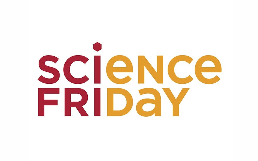
Science graphics often seem to be designed to primarily appeal to children—see science museums—but the new SciFri identity captures the sense of joy and wonder in science in a way that is sophisticated, charming and grown-up. Set in Gotham, the logotype has been broken up into two colors, highlighting the “SciFri” of the show’s nickname. The “i” is dotted with the hexagon, and the identity uses this shape as a basic building block throughout the graphics and website.
The redesigned SciFri site has been organized around a series of 13 topics—Home Planet, Space, Body & Brain, Biology, Nature, etc.—that are used for navigation. The designers worked with the show producers to restructure these categories (from a list of over 20), streamlining topics to make the site easier to use. A set of friendly illustrated icons was developed to represent the various subjects––a DNA strand for Biology, a leaf for Nature, a thought bubble for Big Thinkers, and so on. These icons appear in the navigation column, which playfully expands into the body of the site. Within each topic, the respective icon replaces the hexagonal dot of the “i” in the SciFri logo to create a topical sub-brand. Visitors can experience the show through the lens of their favorite subject. Audio and video are clearly marked and organized, and features are tagged with keywords so users can explore related subjects via a hexagonal “word cloud.”
The previous SciFri site had an aesthetic that was utilitarian but overflowing with information. The designers wanted to take this concept but make it clean, simple, modern and timeless—science, but quirky. Flatow’s goal for the redesigned SciFri site was to create an active, busy community—a place where listeners could access the show’s content in audio and video, and participate in the SciFri experience via blogs and social media.
The new site is active and busy, but digestible. The site is built around a flexible system of modular panels—a changeable Post-It-like grid—that flows into the space. Website features have a built-in interactivity that feels alive. The panels are moving, buzzing. Within each panel, multiple items may be featured, allowing the site to contain just as much content as it did before, close to the surface, but with a cleaner appearance. Each panel exhibits its own behavior—items may appear as a slideshow, scrolling Twitter or Facebook feed, playlist, and so on. Keeping with the science theme, some of these behaviors allow users to consider scientific phenomenon in a new way—for example, rather than use a linear bar, the loading of an audio file is visualized as a circle. Sprinkled in among the panels are “snacks,” small, buzz-y bits of science that are perfect for links in social media.
Another goal of the redesign was to give prominence to SciFri’s weekly show, which is now featured front and center on the homepage. SciFri creates short videos and films to accompany the weekly radio program, and these appear alongside the radio show across the main column. The video player can be opened into widescreen, and works in smartphones and tablets. The show’s current content is kept accessible in a top “drawer” that appears on all pages throughout the site, so no matter how or where a visitor lands, via Google search or the SciFri homepage, they will have access SciFri’s latest show.
Site headlines are set in URW Egyptienne Extra Narrow; the sans serif font used throughout the site is Proxima Nova. The designers implemented a content-management system (CMS) for SciFri staff to easily update content.

