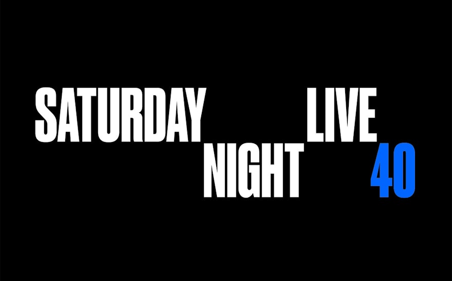
NBC’s legendary sketch comedy show "Saturday Night Live" kicked off its 40th anniversary season in Fall 2014 with a new identity and title sequence designed by Pentagram.
From its groundbreaking roots, “Saturday Night Live” has grown into a New York institution, and like the city, endlessly reinvents itself. The new identity and opening titles marry the SNL graphics with the architecture of the city. At the same time, the sequence playfully looks back to the show’s lo-fi days, with flickering graphics inspired by analog technology.
Pentagram worked closely on the project with Rhys Thomas, the head of SNL's film unit. Lorne Michaels (SNL’s longtime executive producer) was also very focused on the new look for the 40th season. Pentagram has a long history with SNL and has created several previous identities and title sequences. Most recently, Pentagram created the identity for Michaels' reboot of "The Tonight Show" starring SNL alum Jimmy Fallon, which launched earlier this year.
An anniversary logo required something special, and the team wanted to honor SNL’s heritage. There was some talk of wanting the identity to harken back to the early days of the show, but other talk of it not wanting to seem too nostalgic. At its most basic, the identity required flexibility: The team knew it had to have the "40" in it, but also work without it; it had to work as “SNL,” and as the full name. Lorne liked some iterations where the “40” tucked into the “L” of “SNL,” but Pentagram had done similar things for past anniversary seasons, and wanted to bring something new to it.
The final logo treats the words of the title as separate elements that can be arranged on different levels. The structure is endlessly adaptable and subtly echoes the stacked architecture of the city. The number “40” is set off in another color at the end of the name.
Most successfully, the logo doesn’t resurrect the look of any previous identities, but still carries on and evolves the show's particular graphic DNA. The past two logos were onomatopoeiac, meaning they took their visual cues from the way announcer Don Pardo intoned the name in his intro for the show. The new logo similarly breaks up the title to call out the word “night.” The logo is set in a custom version of Druk, a strong sans serif designed by Berton Hasebe at Commercial Type. The font’s final name is still in flux; it may be called Druk Saturday Night Shift, or just Druk SNL.
The open was directed for the first time by Rhys Thomas, who in his position at the film unit has been responsible for shorts like the dead-on Wes Anderson horror parody “The Midnight Coterie of Sinister Intruders.” For the open, Thomas wanted to do something texturally different with the city, to show it in a different way. At the same time, the team wanted to the titles to have the immediate, spontaneous feel the show has had since the beginning. The big answer for the open was aerial shots of the city, a departure from previous sequences. Rhys and his crew rented a helicopter and flew around the city for a night, taking in dramatic panoramic views that capture the magic of the lights. The designers then tucked the logo into the skyline, marrying the show’s iconic title with the architecture. The structure of the new logo lends itself well to animation, and after doing several initial animation tests and concepts in-house, Pentagram found that it looked good when it moved and flickered. The initials remain in place when the rest of the logo flickers off, an approach that was used for the cast names as well, leaving just their initials before cutting away. RGB “artifacts” inspired by early VHS taping technology were added around the graphics, a throwback to the first seasons of the show. Additional camera light effects like lens leaks were laid into the footage to give the whole sequence a dreamy, light-filled version of New York at night.
Every year the SNL titles are developed at a typically breakneck pace. In a coup for the show, SNL got Yankee Stadium to agree to put the logo up on the Jumbotron as the helicopter flew over. These were initially supposed to be stills, but mid-flight the team decided an animation would work better. For one bumper, Rhys Thomas and Alex Buono, the cinematographer, shot the city using a Bouket on the lens, a cut-out that turns all the points of light into whatever the template is—in this case, the SNL logo. In the final bumper, the lights of a city street scene come into focus as hundreds of SNLs.
The team expanded on the idea of placing typography into the cityscape in a series of bumpers. The designers worked with the team at Pixelstick to place animated versions of the logos into timelapse video of the locations, so the graphics appear to interact with their surroundings. One bumper utilizes an alternate logo that the designers based on a graffiti version they found in an early title sequence. A mix of graffiti and neon, the redrawn logo appears against a backdrop of the Metropolitan Museum of Art and is a fun nod to the show’s roots. The graphic will also be used on merchandise tied to the anniversary. In another mix of contemporary craftsmanship and throwback technique, Thomas also had the idea to make a 3-D printed version of the logo that they could shoot around the city and even on set. Sequences were filmed with the logo on the pavement of the streets, on escalator and in an elevator and in a phone booth.
Pentagram also designed a commemorative 40th anniversary book, published by Taschen.

