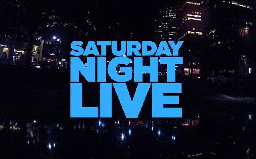
NBC’s legendary sketch comedy show "Saturday Night Live" launched its 38th season with a new title sequence designed by Pentagram. Inspired by the lights and architecture of New York City at night, the dynamic, highly graphic sequence deconstructs the cast, title typography and the city itself through a shimmering, slightly trippy prism of dots and angles. The new sequence accompanies major cast changes for the show, and the titles introduce the SNL players with beautiful portraits by longtime SNL photographer Mary Ellen Matthews, animated with jump cuts.
The designers worked closely with SNL producers James Signorelli and Steve Higgins on the project. “Saturday Night Live” is famously broadcast “live from New York,” and the title sequence always depicts the city as a big party. The show is a comedy, but the titles are not typically funny; rather, they serve as a friendly, straightforward introduction of the players with the city as a glamorous backdrop. The show has an established visual personality, and for the designers part of the fun has been creating new, different takes on the same theme. The titles are not redesigned every year, but the new season includes major cast changes—the introduction of featured players Aidy Bryant, Tim Robinson and Cecily Strong; the return of Jason Sudeikis; and the departure of favorites Kristen Wiig and Andy Samberg as well as Abby Elliott—and the time felt right for a fresh opening.
The previous title sequence featured the cast filmed in familiar New York locations. For the new sequence Signorelli wanted to make a more graphic visual statement using stills of the cast. Pentagram developed an idea inspired by the lights and angular architecture of New York at night: the lights become dots and the angles are slices. Typography and footage are abstracted through the concept, with cast names appearing as a series of circles that come together to form letters. At the same time, images are sliced and layered to create a sense of dimension and movement.
The final effect is elegant and fluid, creating diamond-like facets that are constantly shifting, like reflections of light in glass or glimpses of the city from a moving taxi. Signorelli and director of photography Harrison Boyce shot the city streets, which provide transitions between the portraits of cast members by Mary Ellen Matthews. The cast is the star, not the graphics, but the sequence finds a balance between image and typography that is impressionistic and very New York. (Since the premiere, the stop-motion portraits have become popular as gifs on Tumblrs and blogs.)
The entire project was completed in two and a half weeks. Much like the process of creating an SNL episode––writers, players and producers hunker down and create a show from scratch in a few days’ time––the designers found themselves in a race to finish the titles in time for Saturday night’s premiere. SNL’s casting is usually in flux until the last minute, and with the big changes this year, the deadline was even more pressing.

