Pentagram built the brand identity around a core ‘timeline’ visual, representing a progression from functional solutions to transformative organisational and societal perspectives.

The bespoke wordmark reflects the timeline motif by featuring strong vertical strokes and reductive character constructions.

The uppercase lambda (Λ) glyph is a fundamental element of Satalia’s algorithmic concepts and forms a bold and recognisable stamp.
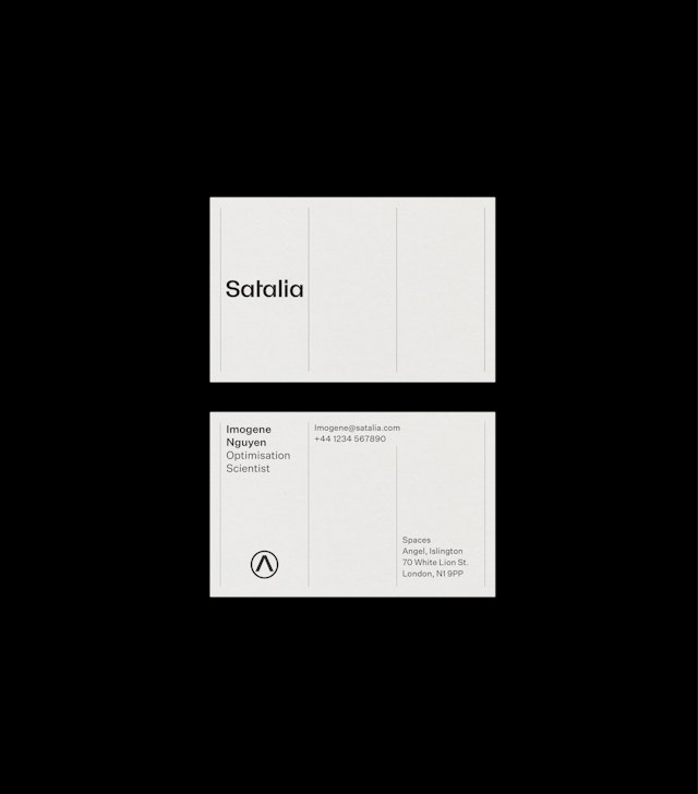
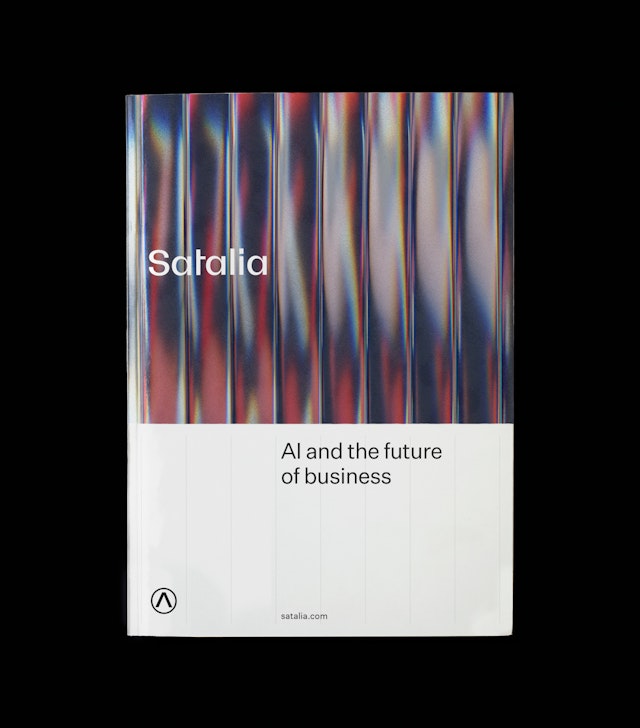

The brand has a counterpart dark, monochrome palette allowing Satalia to shift seamlessly between the client facing, front-end, full colour version and a recruitment facing, back-end, technical version.
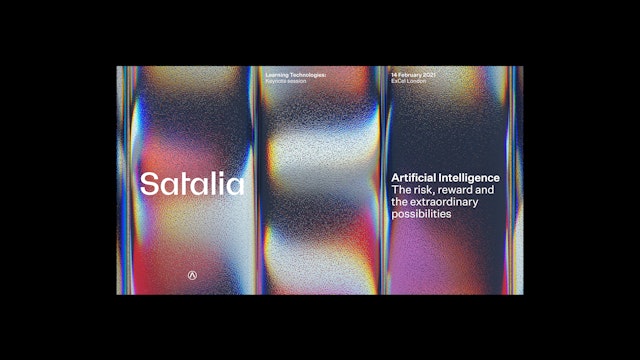
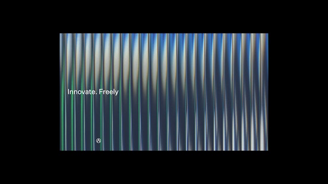


The wider graphic language's use of vertical gridlines creates a robust layout system for both structured, rational presentation of content and dynamic typographic composition.


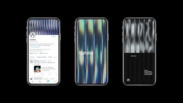
Pentagram has designed the brand identity for Satalia, a London-based company pioneering the use of AI within business, the workplace and society. Beginning with logistics and organisational problem-solving through its unique combination of machine learning and optimisation, Satalia’s tools and vision scale to reevaluate organisational structures within individual businesses themselves, the working economy at large and ultimately the way we all contribute, earn and collaborate globally.
Pentagram has built the new Satalia brand identity around a core ‘timeline’ animation and image library, representing this progression of individual functional solutions to transformative organisational and societal perspectives. Mirroring Satalia’s decentralised structure, individual columns of motion and colour are stacked together to form a shared collective vista. The primary colour palette is black and white, with waves of contrasting, bright gradients moving through the space and refracted to create an infinite spectrum of possibilities, with dynamic movement showing the adaptable and responsive nature of Satalia’s products and structure.
The bespoke Satalia wordmark reflects the timeline motif by featuring strong vertical strokes and reductive character constructions that are matched with grotesque detailing to pair with the brand font, Untitled Sans, a modern and tonally minimal grotesque style. The brand symbol is a simple, graphic, uppercase lambda, Λ, typographically matched to the wordmark. The glyph is a fundamental element of Satalia’s algorithmic concepts and the brand symbol forms a bold and recognisable stamp at large and small sizes when placed within the verticality of the design language.
The wider graphic language also compliments the timeline through its use of vertical gridlines. Creating a simple, robust layout system that not only allows structured and rational presentation of content but, like the timeline, can scale in column width and form a minimal background for dynamic typographic composition.
Satalia’s brand identity helps it to engage clients, institutions and investors, with the possibilities of AI across all aspects of their organisation. However Satalia also needs to attract world-class talent in order to tackle the hardest optimisation problems, build a decentralised infrastructure and share in its collective long-term vision. In order to achieve this the brand compliments the brighter client-facing tones with a counterpart dark, monochrome palette with matching visual assets. This allows Satalia to shift seamlessly between the front-end, full colour client facing brand to the back-end, blueprint, technical version speaking to those who want to be part of a company which aims to revolutionise society’s approach to work and its worth.
Office
- London
Partners
Project team
- Jack Llewellyn
- Nav Bhatia
- Luis Gutiérrez
Collaborators
- Simple Revolution, Strategy
