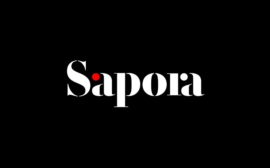
The Sapora logo is inspired by the stencil lettering found on spice freight packaging. A bright red dot features as part of the letter ‘a’ and represents the intense hit that spice gives to food, adding flavour and pleasure to the gastronomic experience.
Learn more about the project
