New logotype for the Book Festival features geometric letterforms.

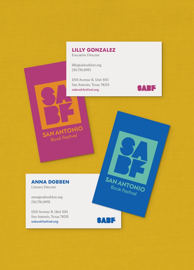
The wordmark is available in a wide array of festive color combinations.

The San Antonio Central Library designed by Architect Ricardo Legorreta.

Wordmark references the library’s design.
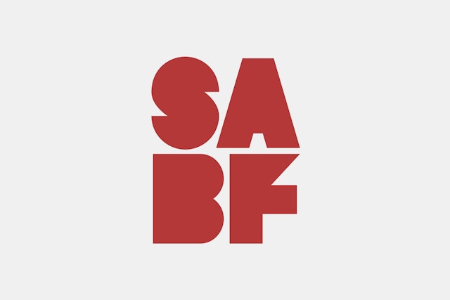
Logotype can be used in or out of the box.

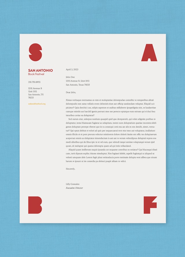
Horizontal lockup of the new logotype.


New identity was inspired by the color of San Antonio.


Design system for the Book Festival’s sub-brands.


Colorful patterns are available as brand tools.


Imagery can be used with letterforms.


Poster designs along the San Antonio Riverwalk.


Festive apparel designs.


Playful application examples.

Horizontal wordmark lockup used on website.


Remember the Alamo! And the Book Festival.