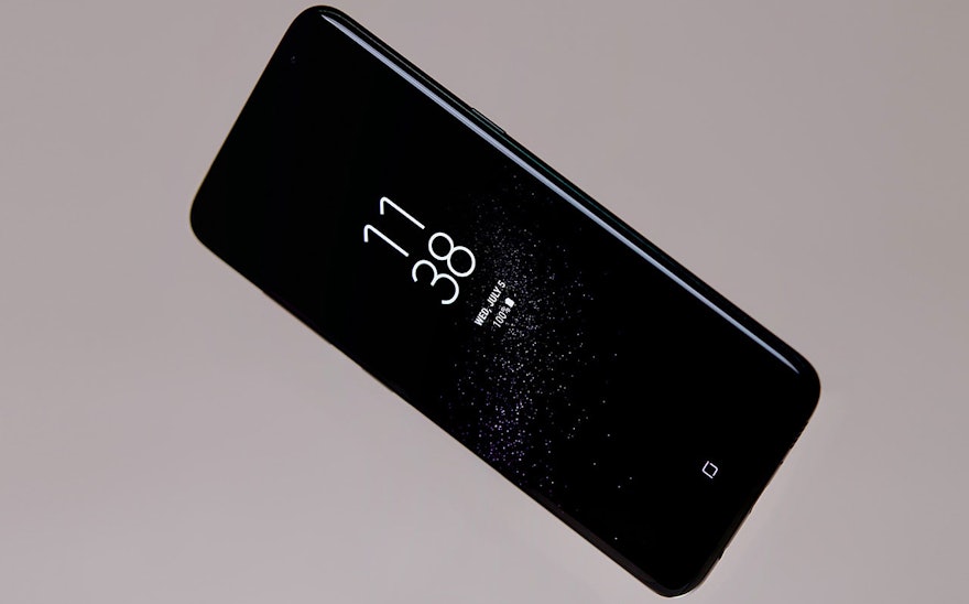
The Samsung Galaxy S8 and S8+ are the flagship smartphones of Samsung Mobile. The innovative design of the S8 pushes the boundaries of traditional smartphones with a sleek, elegant design and the stunning Infinity Display, the biggest screen ever seen on a mobile device of this size.
Pentagram collaborated with the Samsung UX Innovation team on the design of the iconographic and color framework for the smartphone. The graphics are inspired by the refined industrial design of the S8, creating one continuous product experience for the user. The project also included the development of the brand wordmark for Bixby, Samsung’s virtual assistant.
Samsung and Pentagram took the organic lines and curves of the S8 as the foundation for its graphical user interface. The Infinity Display is an immersive end-to-end screen that curves around the edges of the phone and spills over the sides. This seamless flow extends to the visual language for the UX interface, which acts as a cognitive bridge between the hardware and software and facilitates interaction between the physical and digital space.
The team developed an iconographic concept that led to the overall design direction set by Samsung. The icons are dynamic, contemporary and playful, setting the S8 apart from the flat graphics and more literal visual representations of other systems. The designers achieved this with a concept they call “Light and Line.” The icons are drawn in a single expressive line with breaks that help abstract the forms. Incorporating simplicity, perception and movement, the approach renders the icons in interesting and unexpected paths that suggest light playing across an object. The cuts in the line split the icon into two distinct halves that lend dimensionality and balance positive and negative space.
Consistency is key. In most smartphones the product and system icons follow different visual conventions; in its previous Galaxy phones, Samsung employed a mix of existing Android icons and its own custom icons. For the S8, the company wanted a signature interface that helps elevate the user experience, creating a cohesive “ecosystem” for the S8 based on the sleek and elegant design of the smartphone.
Light and Line has been applied across the entire user interface, starting with the Home, Back and Recents keys located in the navigation bar at the bottom of the phone. These three “soft keys” are now part of the screen, integrated into the display itself. The team developed basic foundational grids for the icons and used the standards to generate a wide range of symbols that mix abstract representations (a planet for Internet, a flower for Gallery) and actual functions (a folder for My Files). Existing icons like Camera and Email have been graphically simplified to become part of the system. The icons are scalable, allowing them to be adapted for future uses and evolutions in the interface, including animation.
The characteristics of the iconography helped inform the design of a new custom font, also called Light and Line, in both Light and Regular weights. The elongated letterforms reflect the graceful proportions and curves of the S8 and complement the icons. The font is most notably used for the numerals in the clock of the Always On Display and Lock Screen.
The grid provides consistency across the system so the icons all appear to be part of the same family. The framework fuses a base grid (with a base number of 4) and a circular grid to create a unique Samsung grid that supports both a strong structure and graceful curves. A Light and Line style guide helps direct the process of producing icons, providing a kit of lines, curves and circles to build the forms, and detailed instructions that help guide the overall proportions and degree of curving shapes. Samsung’s in-house team will utilize these standards as they continue to extend the family.
The system also includes the “container,” a graphic shape that accommodates the icons, with curvature based on the phone, and is a derivative of the tittle from the ‘i’ of the Samsung One font originally designed by Neville Brody. The simplicity of the icons is echoed in a color palette of four base colors—green, blue, red and orange—which can also be used in gradients. A graphic framework was established for the screen backgrounds, which feature shifting patterns of angled lines, a nice contrast that sets off the circular forms of the containers.
Bixby is the S8’s voice-based intelligent user interface, or “agent,” on the device, helping to make users’ lives easier by responding to queries, providing information and facilitating interactions. In an advancement in the AI voice assistant category, Bixby-enabled applications will allow users to call on Bixby while in the app, allowing them to carry out their work-in-progress continuously without leaving the app. The Bixby technology will gradually be incorporated into additional connected Samsung devices, electronics and appliances including smart fridges, televisions, washing machines, air conditioners, and more.
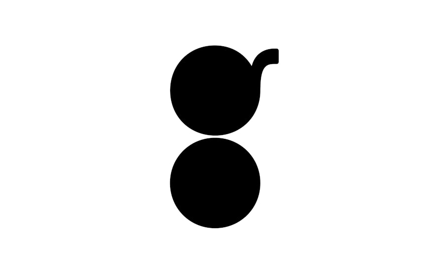
The Bixby wordmark echoes the look of the Light and Line typeface, built of letterforms with cuts that suggest points of connection. Smart, friendly and dynamic, the wordmark has personality, helping to establish Bixby as a unique brand.
Final work on the product was designed and developed by UX Design Group 1, UX Innovation Team, Mobile Communications, Samsung Electronics.

