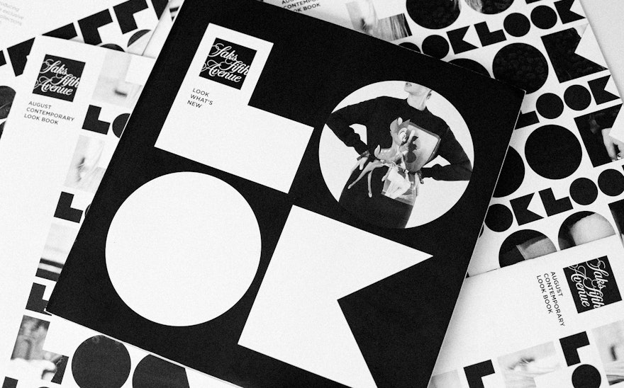
The campaign builds on Saks' identity.

The highly graphic campaign invites shoppers to take a look.
1 The campaign builds on Saks' identity. 2 The highly graphic campaign invites shoppers to take a look. 3 Letters are die-cut on catalog covers to display images inside.

Letters are die-cut on catalog covers to display images inside.

A catalog layout places images in letterforms for a closer look.
4 A catalog layout places images in letterforms for a closer look.


