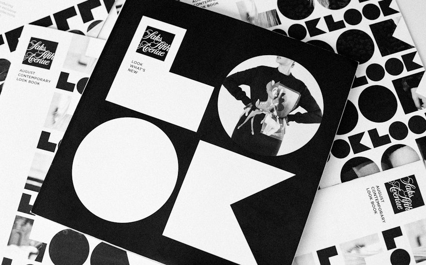
One of fashion's most gratifying thrills is finding new and unexpected pieces and putting them together to make a fresh look. The Fall 2013 campaign for Saks Fifth Avenue showcases the luxury retailer as the ultimate place for fashion discovery. Designed by Pentagram, the campaign uses the word “LOOK” as a bold, attention-getting graphic motif that invites shoppers to explore the store and its style. The campaign builds on our identity for Saks and was developed in collaboration with Terron Schaefer, Saks’ executive vice president and chief creative officer.
The "LOOK" wordmark was designed as custom typography and appears in the signature black and white of the store identity. Repeated as a pattern on shopping bags and catalogs, the simple, geometric letterforms become a highly graphic texture that literally makes you look. In keeping with the theme of discovery, the letters can be used as mini-portals to focus on clothes, jewelry and accessories. Some letters are die-cut on catalog covers to show a peek of the first page inside; other applications place images within the letterforms, for a closer look.
For the designers, the challenge of the Saks seasonal campaigns is they must coordinate with the store’s overall identity; a "LOOK" bag still has to read as a Saks bag. This usually means that, in addition to being black and white, the designs are modular, and often based in squares like the master identity. The campaigns must also serve as a frame for a wide range of specific merchandise, including single items and groups of items; and in different contexts, like print, advertising, and in-store merchandising. This often leads to simple motifs that can withstand an endless range of applications. Previous campaigns have used objects, arrows, the store’s Twitter handle, and flowcharts.
For the new campaign, the designers had the added challenge of coming up with another way to design the word “LOOK,” having previously solved this problem for the New York City Department of Transportation.
Stylish and playful, the Saks "LOOK" graphics can be arranged in multiple configurations for everything from shopping bags, boxes and visual displays to "LOOK" books, catalogs, direct mail, social media and the website. Saks has also developed a series of taglines for different aspects of the campaign, including “Look What’s New” sections in stores, "Making of a Look" style tutorials, and “Look Closer” features that point out details of the craftsmanship of various items.
“Saks is not just a place to buy things,” says Terron Schaefer. “It’s the ideal place to 'LOOK' for what’s new and what’s trending.”

