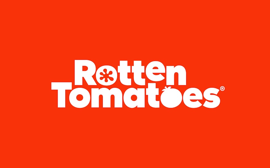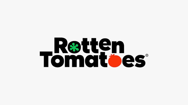
The modern look and feel of the updated logo brings a little style to the splat, while retaining the madcap spirit familiar to fans.


Before heading to the movies or watching new shows, millions of film and television fans log onto Rotten Tomatoes, the online destination where they can check out a variety of reviews and trailers, discuss and debate with other fans, and see how releases rate on the site’s famous Tomatometer ranking them from “rotten” to “fresh,” with the best garnering the coveted “Certified Fresh” score. Pentagram collaborated with Rotten Tomatoes to refresh the brand itself, designing a new logo and monogram in the first significant update to the identity since 2001.
Originally launched in 1998 as one of the first online review aggregators, Rotten Tomatoes’ profile has increased as studios have recognized it as an important place for fan engagement, and pay close attention to user feedback that can impact a film’s performance at the box office. Growing into a reputable brand, the Rotten Tomatoes identity is now utilized for publicity, promotion and events, and the logo needed to look professional and credible, while still retaining a bit of the madcap spirit familiar to fans.
The update introduces a modern look and feel that distills the brand's joyful, wacky attitude in a streamlined design that works well across online and mobile platforms. The refresh brings a little order to the freewheeling discussion with a sharper font and cleaner presentation, and includes a monogram that can be used as a social media icon.
The wordmark places the letters of each word on a single baseline, but the “e” in “Rotten” still pops up, a nod to the bouncing typography of the previous logo. The splat has been relocated to the word “Rotten,” where it appears reversed from the center of the “o,” balanced by the tomato that doubles as the second “o” in “Tomatoes.” For the logo, the designers modified the geometric typeface Maax (designed by 205 Type Foundry as a “sans serif for all tastes”), which has ripe round letters and a friendly personality akin to the zany Ad Lib typeface used in the original logotype.
The Pentagram team refined the shapes of both the tomato and the splat, moving away from the goofy, cartoon-like vector illustrations of the previous iterations to sleeker silhouettes. The full and spilled popcorn buckets of the audience score icons have also been simplified, and a richer, more cohesive color palette established that makes bright orange-red the primary color.
Rotten Tomatoes updated other icons, including the “Certified Fresh” logo, and extended the look and feel of the identity to the website and social platforms. In keeping with the feedback-driven ethos of Rotten Tomatoes, the project incorporated extensive consumer testing with the site’s passionate, opinionated fans to get everything just right.
“Our goal with the Rotten Tomatoes redesign was to preserve the brand essence our fans have come to know and trust, while building a modern and cohesive visual identity that can live across all platforms in the digital and physical worlds––from mobile to video to live events,” said Jeff Voris, Vice President, Rotten Tomatoes.
Office
- New York
Partner
Project team
- Todd Goldstein
- Lorenzo Fanton
- Greg Morrison
- Lisa Grant
