Design has always played an important part in Roche’s offer—its archive is full of many examples of the pioneering Swiss Style, and this exceptional legacy inspired the subtly-evolved look and feel of the new Roche brand.

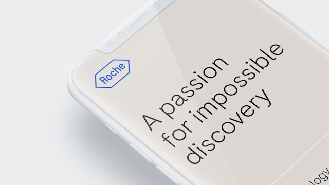
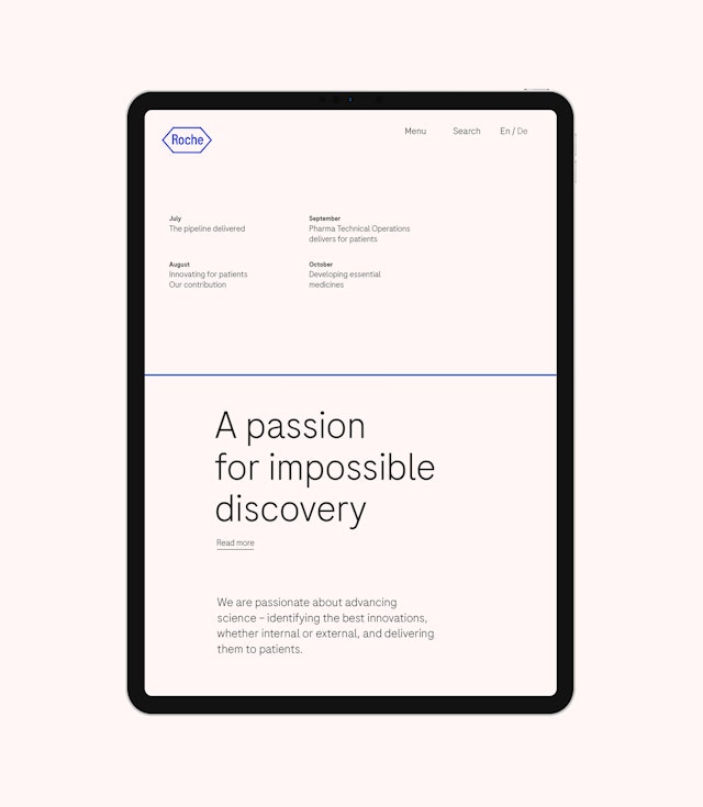
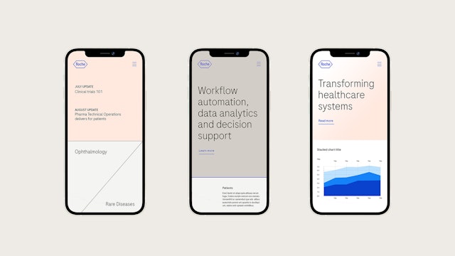
A new streamlined design system was created—centred around the iconic Roche logo, the identity has been refined to work across all online and offline platforms and applications.


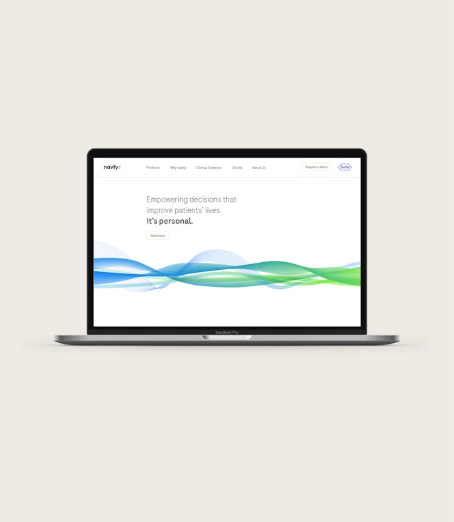
The ‘Roche Blue’ is now a more vibrant, richer shade of blue, and a broader palette was created, taking the Roche brand from a blue and grey tonal landscape to a more vibrant, human and warm tonal range.
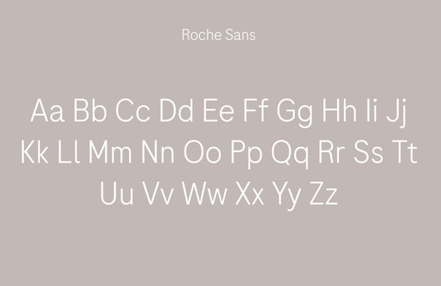
To further differentiate Roche from other healthcare brands, an elegant and versatile bespoke typeface was created. Roche Sans and Roche Serif were designed with a nod to the past, the requirements of the present and to last well into the future.


The iconic logo with the name of the founder, the custom-made font family, the warm and natural colour palette and the close and personal style of photography all ensure that every element in Roche’s new visual identity toolkit works together to convey the vision of ‘One Roche’.
Pentagram and Roche collaborated to design a new brand identity for the global healthcare organisation. Founded in 1896 in Basel, Switzerland, as one of the first industrial manufacturers of branded medicines, Roche has grown into the world’s largest biotechnology company and the global leader in in-vitro diagnostics. The company pursues scientific excellence to discover and develop medicines and diagnostics for improving and saving the lives of people around the world. A pioneer in personalised healthcare, its mission is to further transform how healthcare is delivered to have an even greater impact.
Roche aimed for an authentic and distinguishable visual identity which would differentiate it from its competitors, avoid further brand dilution due to diverting identities, and support its 10-year ambitions and ‘One Roche’ initiative, by helping it to come across as one company.
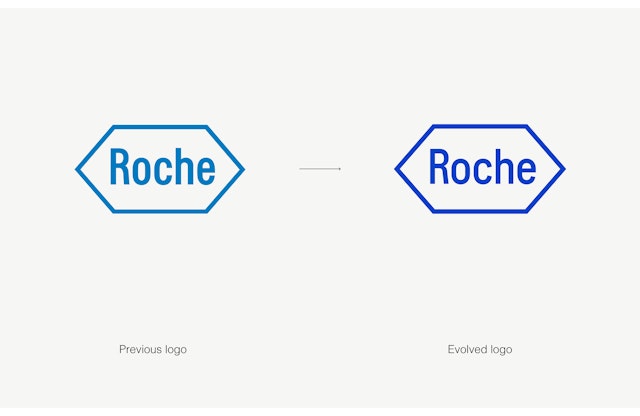
Roche’s previous brand concept was implemented in 1996. As well as showing major gaps when applied digitally, on a strategic level, the brand did not support the company’s vision for ‘One Roche’, which called for a more unified appearance.
It was hoped that evolving the Roche brand would help it to become more visible and more approachable and ensure employees are well-equipped for amplifying the brand vision to become more consistent, relevant and inspiring.
The challenge for Pentagram and Roche was to create a new identity which would respect Roche’s trusted brand while embodying its future aims and ambitions. Design has always played an important part in Roche’s offer—its archive is full of many exceptional examples of the pioneering Swiss Style, and this exceptional legacy inspired the subtly-evolved look and feel of the new Roche brand.
A new streamlined design system was created—centred around the iconic Roche logo, the identity has been refined to work across all online and offline platforms and applications.
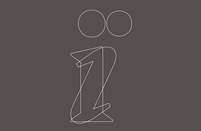
The new logo uses a condensed version of the new Roche custom typeface commissioned for the brand evolution. Influenced by the letterforms of the previous Roche logo, this has been placed back into a redrawn hexagon (the first hexagon logo was introduced in 1971 and has been slightly adapted multiple times over the years). These new letterforms have more open counters which allow the logo to work seamlessly at different scales, particularly within the digital space.
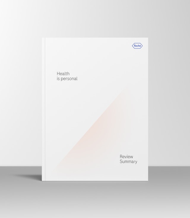
The ‘Roche Blue’ is now a more vibrant, richer shade of blue, and a broader palette was created, taking the Roche brand from a blue and grey tonal landscape to a more vibrant, human and warm tonal range, which also helps to distinguish it from its competitors.
A gradient style was introduced into the brand toolkit as a way to use colour in a human but sophisticated way. The gradients mimic the unique 49-degree angle found in the Roche logo.
To further differentiate Roche from other healthcare brands, an elegant and versatile bespoke typeface was created. Roche Sans and Roche Serif were designed with a nod to the past, the requirements of the present and to last well into the future.
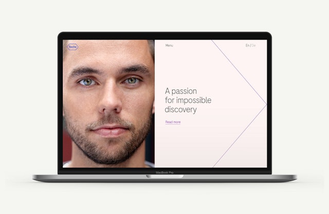
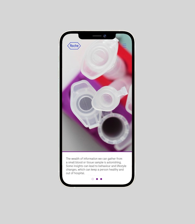
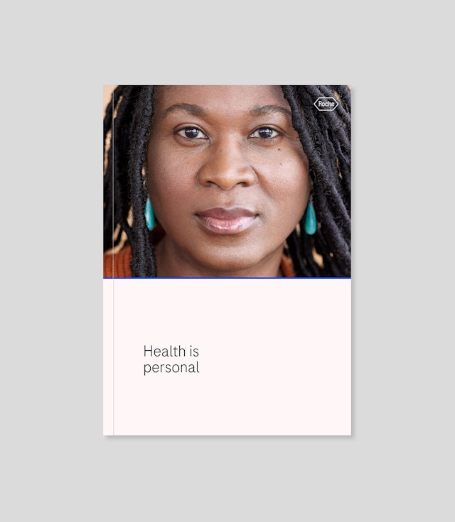
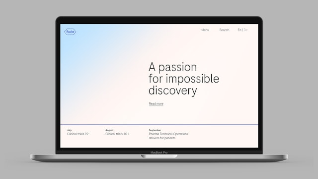
Photography plays a key role within the Roche brand, adding warmth to the brand language. Strong portraiture with images that focus on the individual with tight crops and direct eye contact instantly provide an emotional connection to the viewer and reinforce the message about health being personal. These are accompanied by abstract images that capture everyday objects within Roche in their purest form—they also feature the unique ‘Roche angle’, and act as backgrounds that interact with the keyline system.
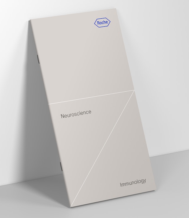
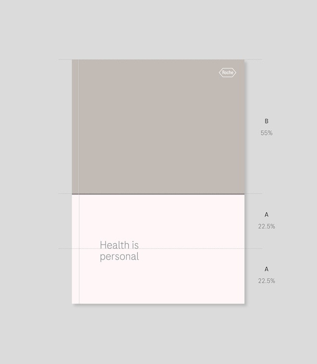
A keyline system influenced by the Roche logo creates a simple, unique and ownable graphic language that is unmistakably Roche. Based on the hexagon and its geometry, the flexible system offers several ways for the keylines to be used in both composition and colour.
A flexible grid system based on the proportions of the Roche logo was designed to streamline content across all brand communication. The system is based on a proportional ratio of space that can be flexed across vertical and horizontal applications.
The iconic logo with the name of the founder, the custom-made font family, the warm and natural colour palette and the close and personal style of photography all ensure that every element in Roche’s new visual identity toolkit works together to convey the vision of ‘One Roche’.
Office
- London
Partner
Project team
- Hans Arnold
- Jack Brown
- Rhian Edwards
- Federico Gaggio
- Katerina Kerouli
- Gabrielle Knowles
- Eoghan McMahon
- Alice Murray
- Daniela Perez
- Marisa Piñana
- Nathalie Shores
- Charlotte Selby
- Yuri Suzuki
- Shirley Wang
- Alex Wright
- Jess Yanzio
Collaborators
- Colophon Type Foundry
