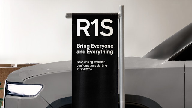
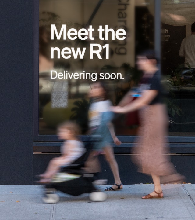
Echoing shapes and curves found in the cars themselves, the humanist letterforms are designed to function as an integral part of the vehicles and of the Rivian brand experience.


The goal was to create a typeface that felt true to the values of Rivian: clean, modern and powerful, while also warm, organic and human.

For the dashboard UI, legibility and readability of the typeface were top of mind, with the goal of showing information with clarity and ease.

The designers developed a monospace version of the font for the speedometer, adjusting the letterforms for an equal width and visual weight.

With its dual emphasis on sustainability and adventure, Rivian aims to redefine the future of transportation. Founded in 2009, the American manufacturer of electric vehicles (EV) offers SUVS, trucks and vans optimized for off-road recreation and commercial use.
Pentagram has created a new custom typeface for Rivian’s vehicle UI that reflects the outward-looking spirit of the brand. Echoing the shapes and curves found in the cars themselves, the humanist letterforms are designed to function as an integral part of the vehicles and of the Rivian brand experience. The font is also used in the designation for each model.
The Pentagram team collaborated closely on the project with the leadership at Rivian, including Jeff Hammoud, Chief Design Officer, and Shaun Harris, Senior Director of Experience Design. The goal was to create a typeface that felt true to the values of Rivian: clean, modern and powerful, while also warm, organic and human.
The original brief called for the design of custom display numerals for the digital UI in the vehicle dashboards. This was then extended to a full alphabet, with the characteristics of the numerals carried over into letterforms. The new typeface is adapted from the contemporary grotesk Söhne, originally designed by Kris Sowersby at Klim Type Foundry.
The Pentagram designers started with a zero that references the unique elongated oval of Rivian headlights. Working alongside Rivian and Klim, Pentagram made further adjustments to the letterforms of Söhne for subtle touches that felt distinctly Rivian. Curves, counterspaces and apertures in the characters are finessed to look rounder and more open. At the same time, the flare on terminals was reduced for a more streamlined appearance.
The letters and numerals come together in the various Rivian vehicle models–– R1, R1S, R1T and R2––and others yet to be introduced (R3, R3X and beyond). Each of the lockups are carefully constructed to balance the letter and numeral with a strong visual prominence. For instance, the “2” is widened for equal weight with the “R.” A rounded corner in the aperture of the “R” nods to the Rivian symbol.
For the dashboard UI, legibility and readability of the typeface were top of mind, with the goal of showing information with clarity and ease. The designers developed a monospace version of the font for the speedometer, adjusting the letterforms for an equal width and visual weight. The team carefully considered how the numerals would look as they changed on the display, ensuring a smooth visual transition that wasn’t jumpy or distracting.
Multiple weights of the typeface were created for a consistent experience across a range of scales and uses. Rivian acquired a full license of the custom typeface so it can continue to be modified and adapted as the company evolves and grows in the future.
Office
- New York
Partner
Project team
- Jun Jung
- Ruben Gijselhart
- Dana Reginiano
Collaborators
- Gerard Mallandrich, animator
- Andrea Pascual, animator
- Kris Sowersby, Typeface Design
