Contemporary American society has become increasingly fragmented, with people separated both physically and socially based on ability, age, income, and belief. A host of colliding crises, including the COVID-19 pandemic, embedded structural racism, and deepening political polarization, have only exacerbated these divisions.
Presented by the Center for Architecture in New York, Reset: Towards a New Commons considers how spaces may be designed for all, addressing the importance of barrier-free environments and practices rooted in “Universal Design.” The exhibition features four projects developed by interdisciplinary design teams—one focusing on New York City, one on Cincinnati, and two in the Bay Area—that envision new modes of living collaboratively. Pentagram developed an exhibition design for Reset that builds on these ideas of community and coming together.
Pentagram worked closely with co-curators Barry Bergdoll and Julia Barton and each of the participating teams on the presentation of their projects. The challenge was devising a scheme that would allow the eclecticism of each team’s solution and variety of content to shine through, while still maintaining a cohesive framework throughout the multi-level gallery space.
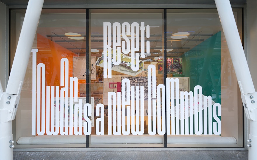
Working with Jangs Müller Type Foundry, the Pentagram team developed a custom display typeface called “Together” that is both dense and elastic: Its most distinctive feature is its ability to stretch vertically, evoking an urban cityscape as well as themes of growth and unity. Anchored along the ceiling and floor, the type extends and contracts vertically, and in punctuated moments, the two sides reach towards each other to interlock. The dynamic typography is complemented by a vibrant, high-contrast color palette that is used to organize the content and create zones for each project.
An inspiration for the exhibition design comes from the neighborly urban phenomenon of hanging clothes lines between apartment buildings—an intermingling of the personal and public in a communal space where the layers upon layers of material form their own kind of skyline. The designers applied this idea to the double-height volume of the Center's storefront, with a display of graphic panels of visuals from the four projects intermixed and hung at different depths and heights. The materials can be seen from all levels from inside the galleries and outside on the street, democratizing the viewing experience and offering a kaleidoscopic glimpse into the show.
At the exhibition’s midpoint, the mezzanine space below the hanging panels hosts a Reading Room with a library of books on topics such as Universal Design, accessibility and community building. The designers imagined this as a “town square” where visitors could convene, engage with the collected resources, or simply pause and reflect.
Working with Serweta Peck, the team designed custom fabricated furniture with multi-purpose functionality and adaptability that echo the themes in the show. Tables of different heights accommodate visitors of various abilities and can nest into a large and contiguous formation, or disperse into separate units, while low bookshelves double as seating.
Reset remains on view through September 3, 2022.

