Red Hat is the world’s leading provider of enterprise open source solutions, using a community-powered approach to deliver high-performing Linux, cloud and container technologies. Pentagram consulted on the development of a brand identity for the company, helping it upgrade and modernize its logo and brand system for its first major refresh in almost 20 years. In keeping with Red Hat’s open source ethos, the project was conducted as a radically open collaboration with the company’s leadership, employees and community, with guidance from the Pentagram team.
Red Hat called the initiative “The Open Brand Project,” and the Pentagram team collaborated closely with the company’s in-house marketing and art departments to manage the process. Red Hat believes that openness, diversity of thought and wide participation yield the best results, and these values were applied to developing the identity with maximum transparency and inclusivity. The designers surveyed everyone from the CEO, sales and marketing departments to engineers, developers and support, ultimately collecting feedback from the company’s more than 13,000 employees.
Established in 1993, Red Hat were pioneers in using then-taboo open source technologies to create enterprise software. The company represented itself with a graphic mascot originally known as “The Red Hat Man,” then later called “Shadowman,” a secret-agent figure in a tilted red fedora who hinted at the company’s rogue spirit, sneaking open source past the barriers of proprietary technology companies. (The name comes from one of the co-founders, Marc Ewing, who was famous for wearing a red lacrosse cap in college.) Shadowman became an icon of the open source movement, as well as the personification of Red Hat’s unique culture.
Now, Red Hat is no longer undercover: It is a publicly traded multinational with over 95 offices in 35 countries around the world, and is set to be acquired by IBM for $34 billion. As Red Hat has grown into a mainstream company, it needed a more polished brand identity in line with other technology corporations, and one that could be more easily used in a variety of applications and contexts in the changing digital landscape.
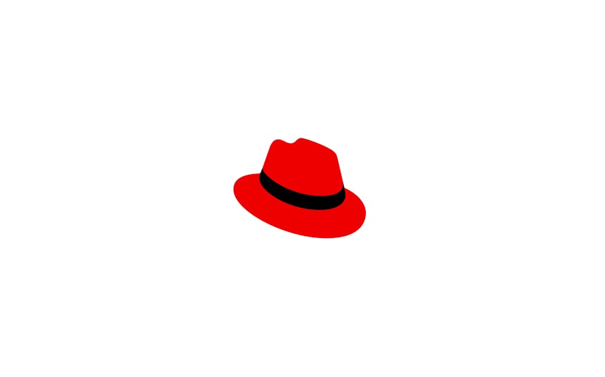
During the rebranding process, interviews with staff confirmed the red hat as a strong symbol of pride for the company’s employees―some even sport it as tattoos. The refreshed identity pares the logo down to exactly what the name says it is: a red hat (with a black band). Pentagram worked with the in-house art department to refine the icon, leading workshops with staff to draw their own many variations on the hat. These were presented to and tested with different divisions and groups, and the final version was decided with the help of a global, company-wide survey, so everyone would feel they had a say in the results. The new hat is drawn at the same angle as the original logo, but streamlined and simplified so it can easily scale to any size or form.
Once the final symbol was selected, the designers turned to the typography. Red Hat had been using the font Interstate, as well as an open-licensed alternative called Overpass as its brand fonts. Working with the type designer Jeremy Mickel, the in-house department created a bespoke sans serif, Red Hat Display and Text, that nods to Interstate but has slightly rounder, more geometric letterforms. The Pentagram team also helped the in-house designers develop comprehensive brand guidelines that cover everything from lockups for sub-brands and divisions, to applications like promotional materials and environmental graphics.

