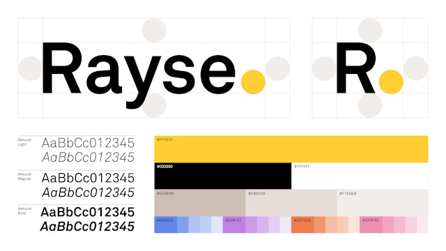
The identity evokes the shining of daylight on the process of buying and selling a home, a ray of brightness that illuminates a complex interaction.


The mark is deliberately neutral and simple, with a bright yellow circle that nods to the name and that also serves as a marker and data point.

We live in a time of accurate, abundant information in our everyday consumer interactions. We can add guacamole and know the price and the arrival time of our burrito in advance. We can see the name and face of the person who’s driving us to the airport and exactly when they turn onto our block. But clarity and communication have been lacking around one of the most significant investments of most people’s lives—buying or selling a home.
Pentagram, working with Amy Goldwasser of Ghost of Honor, developed a name, strategy and visual identity for the new company Rayse, a real-time, data-driven platform that enables clients and agents to collaborate on residential real estate transactions. The platform’s transparency gives accountability and ultimately trust, delivering a better experience to both parties.
The identity evokes the shining of daylight on the process, a ray of brightness, openness and trust. For clients it illuminates a complex process and answers: What does an agent do and what am I paying for? For agents, it makes visible and shareable each step of their work, demonstrating their value.
The mark is deliberately neutral, avoiding the hype and other tropes of the startup world. The founders have deep expertise and success with previous ventures such as NextHome, NextMortgage and Casan Collection, and are partnering with several of the largest brokerage firms in the United States. The identity is designed to communicate maturity over novelty, implying a stable, robust platform.
The bright yellow circle is a nod to the name and also serves as a marker and data point. This theme comes to life in applications as the dots chart progress of the milestones along the home-transaction journey. They symbolize metaphorical and literal steps that a broker takes during the process.
The reduced toolkit of a single typeface (Akkurat), straightforward layouts, and uncomplicated black-and-white photography is intended to echo the brand’s goals of clarity and directness as well as the platform’s easy-to-use software. The end result is minimal yet still remains approachable.
Office
- New York
Partner
Project team
- Jenny Hung
- Antonio Nogueira
- Gracia Lee
- Anna LaGrone
Collaborators
- Amy Goldwasser, strategist
