Founded in 1929, Quinnipiac is a private institution in Hamden, Connecticut, that has grown over the past 30 years from a small local college into a major, nationally recognized university, known for the Quinnipiac Poll, one of the leading political polls in the US. Pentagram has designed a new brand identity for Quinnipiac that visually sets the school apart and lends it a sense of heritage as it continues to expand. Built around a distinctive “Q” monogram, the identity system uniquely bridges the elaborate symbols of historic colleges and the bold look of contemporary universities. The project encompasses the school’s brand strategy and naming; communications, transportation, apparel, online presence and the Poll; and a custom tartan, Quinnipiac Plaid.
Quinnipiac is looking ahead to its centennial in the next decade and wanted to emphasize its position as an ambitious academic institution that now ranks in the top 100 universities in the US. During his tenure (1981-2018), President John L. Lahey helped transform the school from a regional commuter college into a well-regarded university with rising stature and rapid growth, including the introduction of new campuses, schools, majors and graduate programs, and the Poll; a fivefold increase in enrollment; and the doubling of the school’s endowment, from $450 million to a projected $1 billion in time for its 100th anniversary. (Concurrent with the development of the identity, Pentagram designed Quinnipiac: The Lahey Years, a deluxe book that commemorates the legacy of Lahey and his leadership.)
The new branding needed to address several challenges. Private regional universities are increasingly feeling pressure in a marketplace dominated by the big name recognition of Stanford and Ivy League schools like Princeton, Harvard and Yale (which is just 10 miles away, in New Haven) and well-known small liberal arts colleges. Quinnipiac wanted to develop its own distinct identity and sense of place that would help it stand out to potential and existing students and sustain its growth. And as a growing school, it needed a strong, flexible system that could expand along with it.
Pentagram worked closely with Quinnipiac leadership to develop a visual brand strategy that clarifies the school’s brand values for students who are faced with many choices. While many universities have sought to distance themselves from the trappings of a traditional academic heritage, Quinnipiac made the unusual move to differentiate itself with an identity that reincorporates academic symbols and elements. The identity breaks through the visual sameness of educational brands and positions Quinnipiac as a scholarly, transformative collegiate experience with a contemporary outlook.
The brand identity places the “Q” at its center, empowering Quinnipiac to take ownership of the letter and to capitalize (pun intended) on its symbolic potential. As the second most rarely used letter in the alphabet, “Q” is a strong signifier for something that is unconventional, rare and uncommon. The “Q” is made even more unique with sections cut away to highlight the structure of the letterform. This dimensional “Double Q” is the primary icon, with the dual line functioning as a kind of visual amplification or resonance. (A solid version is used for internal communications.)
The monogram is accompanied by a logotype that simply states “Quinnipiac,” putting the university on the one-name basis of other schools. Custom drawn with contemporary typographic details, the monogram and wordmark show craftsmanship and attention to detail that hint at the school’s personalized approach.
A well-defined brand architecture, outlined in comprehensive guidelines, helps unify the university’s many entities and sub-brands into a cohesive whole. The framework also guides the look of all the school’s print communications, including brochures, handbooks, advertising and promotional materials. The identity’s primary typeface is Portrait Q, a specially made version of the neoclassical serif Portrait (customized by Commercial Type, who designed the original font). The secondary typeface is the modern sans serif Atlas Grotesk (designed by Atelier Carvalho Bernau).
Elevated photography standards use a natural, documentary style and editorial sensibility to engage the viewer and convey what it’s really like to experience Quinnipiac. The beauty of the campus is highlighted in photography by Rich Gilligan.
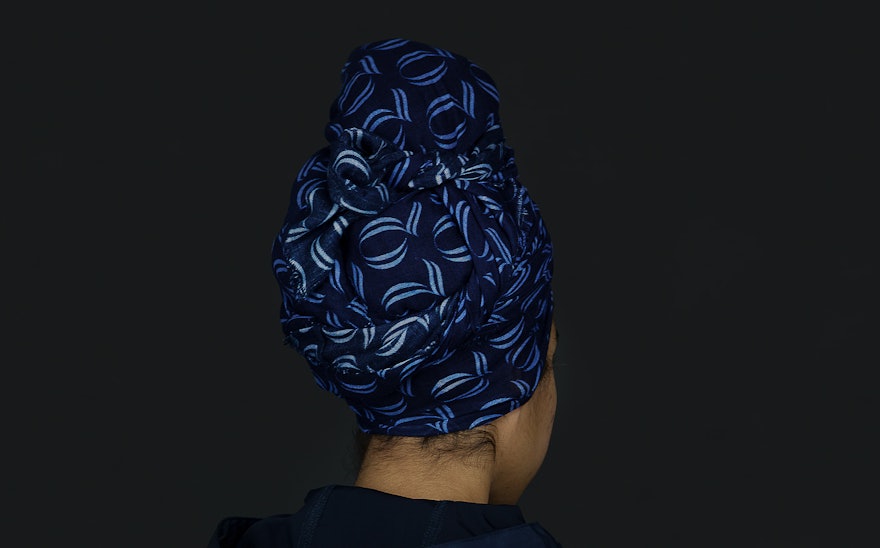
The “Q” monogram was developed with university apparel in mind, so students can wear the logo with pride. As an insignia, the “Q” looks sophisticated, regal and refined, and places the letter on a par with the familiar “H,” “ Y” and “P” of Harvard, Yale and Princeton. The Pentagram team developed guidelines for its application on clothing, notebooks and other ephemera, including hats and headscarves that feature a stylish pattern built of the Double Q.
Blue and gold have long been the Quinnipiac colors, and the identity refines and expands the official palette by deepening the blue into Quinnipiac Navy, and adding a vibrant second blue, York Hill Sky Blue. Along with Bobcat Gold, the colors have been interwoven into a custom tartan called Quinnipiac Plaid. Historically, plaid has been used as a marker of familial and regional ties, and Quinnipiac Plaid carries this tradition forward by signifying belonging to the university community. Plaid scarves and ties connect the school to a classic collegiate aesthetic sensibility, and the asymmetrical plaid can be scaled up and used in dramatic crops to make it more abstract and graphic for unusual applications such as the livery of the school’s Department of Safety vehicles, an homage to Studio Dumbar‘s classic design for the Dutch National Police.
The nationally prominent Quinnipiac Poll is one of the university’s most recognizable undertakings. Pentagram updated the look of the Poll to work seamlessly with the rest of the system. New standards for the infographics make the charts and graphs more visually engaging and easy to read. The styles draw from the identity typographically and build on the Quinnipiac colors with a secondary palette that includes orange, green, turquoise, fuchsia and purple––and most important for a poll that is often politically oriented, a special blue and red.

