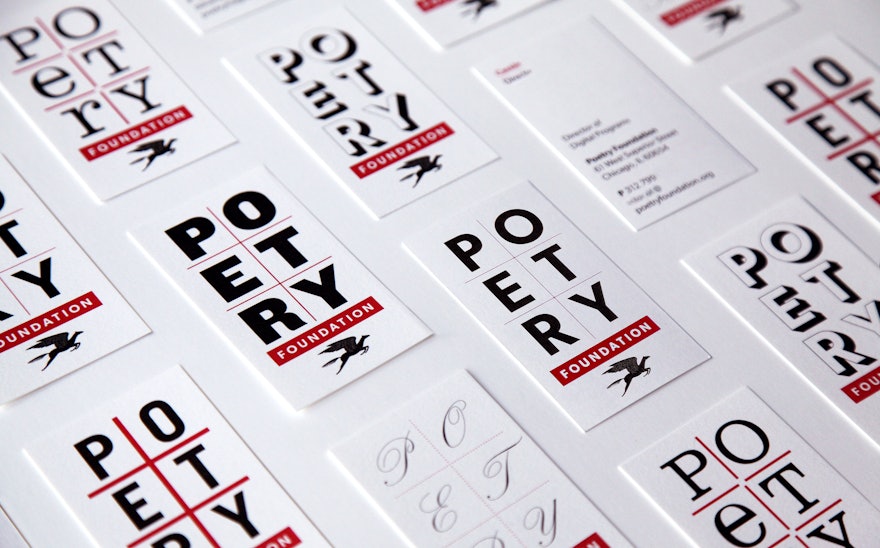
The Poetry Foundation is an independent literary organization with the mission to celebrate its namesake form and raise it to a more visible and influential position in our culture, chiefly through Poetry magazine, published since 1912. Pentagram developed a brand identity for the Foundation, including a new design for the publication, that reinforces it as a vital platform and helps attract the attention of new audiences.
One of the oldest and most innovative literary forms, poetry can be simple or complex, and is also peculiarly visual: The way the words of a poem are arranged on a page has an effect on how they are read, and the “design” of verse conveys the underlying structure of set forms like the haiku, the limerick and the sonnet, which in turn provide the basis for endless variations. Typography is also hugely significant to poetry, and the medium has inspired radical experiments in type for centuries.
The identity of the Foundation and magazine is based in a similar set of rules. The six-letter word “poetry” is arranged in a distinctive two-by-three letter configuration that, within the structure, is endlessly changeable. The name can appear in every style, formal and informal, conventional and radical, bold and delicate. For decades the cover of Poetry was often purely typographic. The redesign continues this approach, but puts the dynamic identity front and center. The result is a visual treatment that goes to the heart of what poetry and the organization and magazine are: always evolving and forever new.
The distinctive look is carried throughout Foundation materials with display typography that breaks apart single words like lines of verse. The identity is set in the forthright sans serif Gibson, and Pietro, previously utilized by the magazine for its poems, has an expanded role as a supporting typeface for collateral. The redesign coincided with an update of the Foundation’s website, led by the agency Fuzzy Math.

