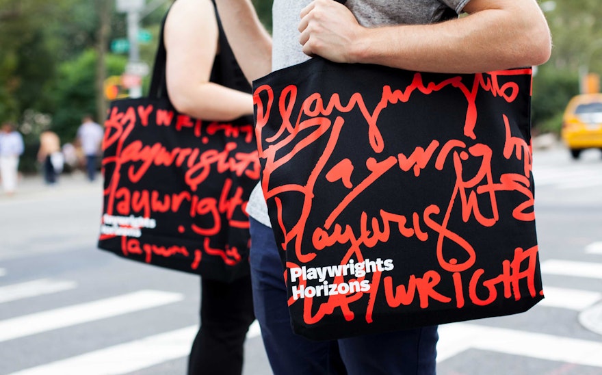
Playwrights Horizons in New York is a writer’s theater solely dedicated to cultivating new American playwrights, composers, and lyricists by developing and producing their work. Playwrights is the only major theater in the country with this specific mission, making it unique to the cultural landscape. Unlike other groups, it avoids revivals, star vehicles and proven names. Pentagram has designed a new identity for Playwrights Horizons that captures this one-of-a-kind company of original voices: The identity features a rotating cast of logos, handwritten by the playwrights themselves.
Playwrights describes itself as “where theater begins” (a statement Pentagram helped develop as part of the group’s messaging), where writers put pen, and words, to paper. The designers decided to take the heart of the brand identity—how the institution presents its name—and put it in the hands of the playwrights and composers, who each leave their own mark on the theater and its audiences. The new system launches with the word “Playwrights” in eight different sets of handwriting, each contributed by a writer from the upcoming season. Each unique logo will be associated with that particular production, and each will be added to an inventory of logos that will be cycled at random on business cards, signage, advertisements, social media, and other print and digital materials.
The designers worked closely with artistic director Tim Sanford, managing director Leslie Marcus, general manager Carol Fishman and marketing director Kyle Sircus to develop the branding. One of the goals was to bridge the gap between Playwrights’ theater uptown on 42nd Street, and the very downtown, cutting-edge sensibility that comes with producing only new theatrical work. Moreover, the organization has a space downtown that will increasingly be used for staging shows; these productions share a location with the Playwrights Horizons Theater School, which is housed there. The identity strikes a balance by evoking the constant groundbreaking and thrilling work developed by the institution.
In applications like the season brochure, the expressiveness of the handwriting is set off by the clean and crisp primary typeface, FF Real, designed by Erik Spiekermann and Ralph Olivier du Carrois, in one of the first branding projects to use the font since its release.
The new identity also helps answer a branding challenge that is common to performing arts institutions. Any arts organization with programming faces the dilemma of promoting its individual productions versus the institution as a whole. Creating a cohesive visual language across shows and seasons played a major role in the project. In the previous Playwrights brand, each show got its own unique show art. What this amounted to, when looking at the body of work, is each show had its own identity. The problem with this is it promoted the plays but not the parent institution. A key way to advance Playwrights as a theater with a point of view and a proven track record of stellar performances was to visually establish each show as living within a larger ecosystem.
For a cohesive look, the handcrafted approach of the identity has been extended to the season imagery, which utilizes illustration and will feature a different illustrator every season. In the new brand system, one artist will be commissioned for the show art for all six or seven productions in the season. The first season’s artwork will be created by the great Seymour Chwast. A nice side-effect of the new system is it gives Playwrights an opportunity to help support other kinds of artists, in addition to playwrights, with these seasonal campaigns.

