Pentagram has designed the graphics for Platform's 2015 Summit, building on the identity they created for the organization. The theme of the Summit was “Give, Get, Connect,” inspired by Platform’s goal of building better professional networks among the pool of remarkable minority entrepreneurs and innovators who are working in the world of technology and startups. The event took place at the Ray Charles Performing Arts Center on the campus of Morehouse College, the famous black men's liberal arts college in Atlanta, Georgia, where the previous Summit was also held, and was again co-hosted by the Georgia Institute of Technology.
Pentagram evolves the look of the Summit with each successive edition. For the event, the designers captured the theme of making connections in graphics that engaged visitors and invited them to take a closer look through the use of optical curiosities and tactile treatment of materials. The environmental graphics interpreted and expressed the Platform identity in ways that transformed the conference location. These were achieved in an inventive, cost-effective manner. For the 2014 Summit, the designers used a massive 30-foot blimp branded with the Platform logo as a conference landmark at the campus. The budget for this event was more limited, and the designers had to find other ways to create a sense of place on the grounds.
Outside the Ray Charles Performing Arts Center, the designers installed a field of flags that featured the conference “keywords”—”innovate,” “inspire,” “envision,” “prosper,” and so on—and a diversity of custom patterns inspired by the idea of networks, technology and the modular iconography of the Platform identity. Each member of the team designed a different black-and-white pattern for the set, and the feather flags—inexpensively sourced online and similar to the ones seen on car lots—came to life in the wind.
The designers had strict limitations on modifying the interior of the Ray Charles Center. Wayfinding graphics could not be affixed to the walls and floors, so a series of freestanding columns were used as temporary guideposts. One of Platform’s goals as an organization is to elevate, and this idea is playfully suggested through environmental graphics that defy gravity.
At the previous conference inflatable spheres with large arrows were anchored to cylinders that displayed directional graphics and maps. This year, the lightness was achieved through an optical illusion. The four-sided columns were mirrored all the way around their bases, to give them the appearance of floating above the ground. The simple trick is a staple of pre-CGI film effects (see Luke Skywalker’s landspeeder in the original “Star Wars”), as well as magic shows. The directories and identification signage stacked Platform’s custom icons up the side of the columns, and at the top, the featured icon was backed by a lighted infinity mirror that extended the graphic into the next dimension—and beyond. The simple effect made the temporary signage seem technological and substantial, while still being economical.
The experimentation with mirrored surfaces extended to the collateral for the event, which referenced the iridescence of circuitry. The cover of the Summit Guide was printed on a reflective foil that was also carried over to a circuit-like pattern on the lanyard card.
The Guide functions as Platform's core documentation for attendees and includes the program agenda, speaker profiles, and sponsor credits. The book featured the influential leaders in technology, business, and culture who appeared at the conference, including Twitter co-founder and CEO Jack Dorsey, former astronaut Bernard Harris, journalist and OZY founder Carlos Watson, and David Drummond, Senior VP of Google. Portraits of the speakers were distilled into stripe-like moiré patterns using the same computational programming utilized to create the stage graphics at the conference. Typography is set in New Rail, the typeface of the Platform identity, and color gradients help give the book a feeling of change, transformation and possibility. For tactility, the Guide was packaged in a paper sleeve embossed with the Platform logo. The identity was also blind debossed on the hard cover of the conference notebook.
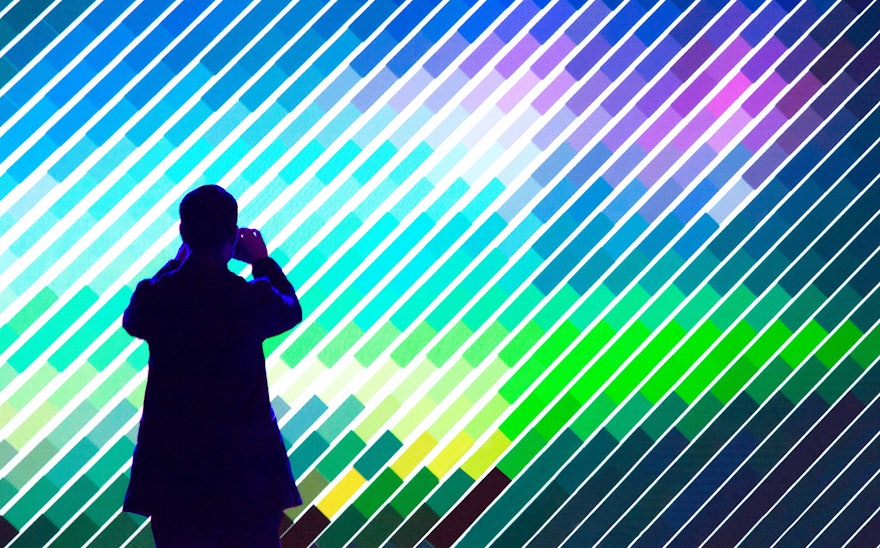
Pentagram also designed the conference stage. As with the previous conference, the organizers wanted a concept that would heighten and amplify the focus on the stage, which featured a massive 4K LED screen with 4K resolution walls to display live visualizations of the speakers. A custom-built computer application transmitted the live video from an HD camera to the LED screens, creating responsive, dynamic graphics of the speakers in real-time, generated in a moiré-like pattern of lines inspired by the theme of connection.
The designers also developed an opening sequence that illustrated the theme of the conference, with networks of lines congealing to form the Platform logo and Summit keywords.

