In honor of our 40th anniversary, Pentagram was invited to present an exhibition at the 7th Ningbo International Design Biennial in Ningbo, China. Pentagram Remixed puts a new spin on our portfolio to locate the ideas and influences that have guided our work across four decades.
Rather than stage a traditional historical survey, the designers wanted to place Pentagram’s work in unusual contexts that would reflect our constantly evolving point of view and allow visitors to make their own connections and associations. The exhibition presents different aspects of our portfolio in a series of “zones” that flow together to create an impression of our collaborative and interdisciplinary approach.
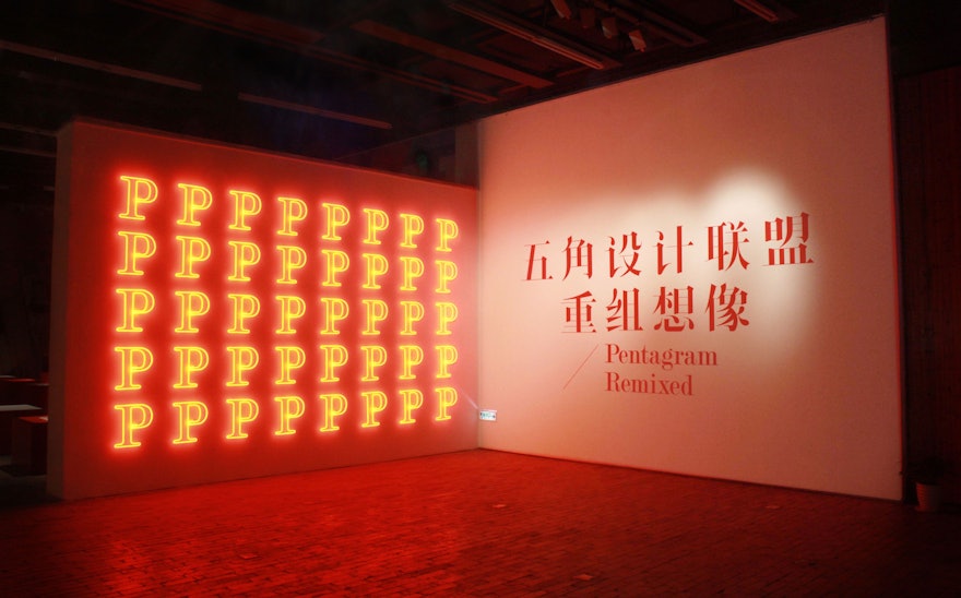
The large scale of the 7,500 sq ft exhibition space gave us plenty of room to play. Jen worked with the New York-based architectural studio (and frequent Pentagram collaborator) SOFTlab to create innovative, immersive environments in several galleries that go beyond putting posters on a wall or books in a vitrine and give visitors an opportunity to interact with the work. Jen also commissioned Synoptic Office to develop a customized Chinese display typeface, Ming Romantic, that was designed to match Pentagram's typeface, Modern No. 20.
Visitors to the exhibition are greeted by an entry wall of 40 neon ‘P’ monograms—in Warm Red 032, of course—and the current Pentagram partnership represented as 19 life-size graphic figures placed along a timeline according to when they joined the firm.
The History section presents a series of 40 posters designed by the Pentagram partners for our anniversary. The posters all use the colors black, white and red (Pentagram Warm Red, again), and cover a variety of subjects, from significant historic or cultural landmarks to events in Pentagram’s history, in designs that range from totally typographic to completely illustrative. The posters have been placed in stacks on the gallery floor; the sheer volume helps give a sense of the firm’s long history.
The Scale zone showcases the wide scope of our work in a mural of supersized images, from the petite Acme Studios P2 pen to the humongous signage of the Arizona Cardinals Stadium, demonstrating how sensitivity to form and proportion are important to any design, whatever the size.
Books are some of our favorite projects, and the Prints section displays 40 books that Pentagram has designed over the years. The exteriors of the books are exhibited on a table in the center of the room, surrounded by their interiors opened on the walls. Visitors are asked to match the covers of the books with their pages.
Marks are identifiers that express the unique character of a brand, institution or organization in line and shape. In the Marks zone, over 400 symbols, marks and logos we’ve designed have been screened on red Plexiglas disks and placed on a table. Visitors can move the disks over projectors to reveal the latent images by projecting them on the walls, a la “Batman.”
Every few years Pentagram publishes an 800-page portfolio documenting our work. Nicknamed The Black Book, the publication arranges its projects alphabetically with minimal context or background about the featured works. The Diversity zone of the exhibition deconstructs this portfolio in a “book cloud” that plots the location of the project/page according to its various formal characteristics––color, shape, size, and so on. Through this spatial mapping in the air, patterns in the work begin to emerge, and the portfolio is experienced in a non-linear, holistic way that reveals tendencies, styles and techniques.
We love telling stories, and the exhibition’s final two zones show how composing sounds and moving images can communicate ideas in an engaging way. The Narrative zone features "The Forty Story," the short film we created for our anniversary, while the Motion zone screens a montage of motion graphics designed for our clients over the years.
Pentagram would like to thank the organizers of the Ningbo International Design Biennial for this fantastic opportunity to present our work.

