Do typefaces matter? In July 2012, the filmmaker and author Errol Morris published a short and rather enigmatic quiz on the website of The New York Times. Without really understanding its purpose, over 45,000 people responded to the quiz, which purported to address the question "Are You an Optimist or a Pessimist?" Morris's real goal, however, was to determine whether the choice of typeface had any effect on a message's believability. His answer: It does.
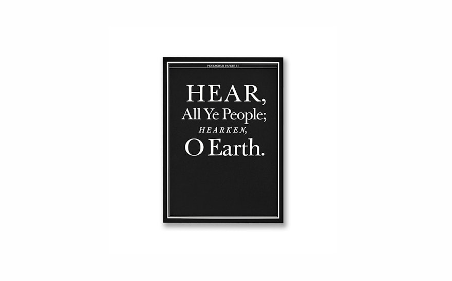
This experiment is the focus of Pentagram Papers 44: Hear, All Ye People: Hearken, O Earth. Designed by Pentagram, the book republishes the two-part Times essay in which Morris revealed the results of his test, and is set almost entirely in the typeface that he determined to be most trustworthy: Baskerville.
Morris's work is characterized by a relentless search for the truth. Pentagram previously collaborated with Morris on the design of two of his books, Believing Is Seeing (2011), in which he examines several famous contentious photographs to determine how what we see is affected by what we believe, and A Wilderness of Error (2012), an exhaustive investigation into one of America’s most notorious murder cases.
Morris regularly contributes to the Times Opinionator blog, and had the idea to use the platform and its wide readership to pursue a new line of inquiry: How does typography shape the way we see the truth?
In a new introduction for the Paper, Morris writes: “We all know that we are influenced in many, many ways—many of which we remain blissfully unaware. Could typefaces be one of them? Could the mere selection of a typeface influence us to believe one thing rather than another? Could typefaces work some unseen magic? Or malefaction?”
The initial online quiz was built around a passage from a book by David Deutsch that declares “we live in an era of unprecedented safety.” After reading the passage, respondents were asked if they agreed or disagreed with the statement. Unknowingly, the participants read the passage in one of six randomly assigned typefaces––Baskerville, Computer Modern, Georgia, Helvetica, Comic Sans and Trebuchet. Approximately 45,000 people responded; in case you’re wondering, about 61 percent of participants were optimists who agreed with statement, while 31 percent were pessimists.
Morris and his co-researchers Benjamin Berman and David Dunning tabulated the results and compared them across typefaces. The passage in Baskerville engendered the most agreeable response among optimists, signaling its believability. In the essay, Morris explores the genesis of the typeface, the history of John Baskerville and his quest to perfect “letter-founding.” (Taken from a version of the Holy Bible printed by Baskerville, the title of Morris’s essay, "Hear All Ye People; Hearken, O Earth," is intended as a playful wake-up call that people should pay closer attention to typefaces.)
The Pentagram Paper is fully illustrated with charts and diagrams supporting Morris’s investigation. Pentagram redesigned and expanded the infographics that originally appeared with the essay on the Times website, and also fleshed out Baskerville’s story with historical visuals. All of the typography in the volume, save for the illustrations of the original quiz in different fonts, appears in Baskerville.
In an interview with Fast Company, Morris says of the Paper, “The typography is just wonderful: it’s a book about Baskerville, printed in Baskerville, that looks like it could have been published by John Baskerville, during his life.”
And how have the results of the experiment influenced his own communication? “I used to write all of my manuscripts in Bembo,” Morris says. “Now I write them in Baskerville.”

